A researcher randomly selected n = 30 drivers who were issued speeding tickets in a city....
A researcher randomly selected n = 30 drivers who were issued speeding tickets in a city. There are four variables in this data set: (1) ID number, (2) age, (3) sex, and (3) size of the car that s/he drove when s/he got the speeding ticket. *Sex (1 = Males, 2 = Females); Size_car (1 = Small, 2 = Medium, 3 = Large).
Data
|
ID |
AGE |
SEX |
SIZE_CAR |
|
1 |
18 |
1 |
2 |
|
2 |
28 |
1 |
2 |
|
3 |
44 |
1 |
3 |
|
4 |
20 |
2 |
2 |
|
5 |
39 |
2 |
2 |
|
6 |
53 |
2 |
3 |
|
7 |
28 |
1 |
1 |
|
8 |
18 |
1 |
1 |
|
9 |
24 |
2 |
1 |
|
10 |
21 |
1 |
2 |
|
11 |
35 |
1 |
3 |
|
12 |
38 |
1 |
3 |
|
13 |
22 |
1 |
1 |
|
14 |
29 |
1 |
2 |
|
15 |
63 |
1 |
3 |
|
16 |
22 |
1 |
3 |
|
17 |
45 |
2 |
2 |
|
18 |
36 |
2 |
2 |
|
19 |
16 |
1 |
1 |
|
20 |
56 |
1 |
3 |
|
21 |
20 |
2 |
1 |
|
22 |
23 |
1 |
2 |
|
23 |
58 |
1 |
1 |
|
24 |
32 |
1 |
3 |
|
25 |
25 |
2 |
2 |
|
26 |
28 |
1 |
2 |
|
27 |
21 |
1 |
1 |
|
28 |
51 |
2 |
3 |
|
29 |
26 |
2 |
1 |
|
30 |
45 |
1 |
2 |
|
Homework Answers
A SPSS data file is created as explained. The variable view of the file is

And the data view is

Problem 2:
In this Data, Age is a quantitative Variable (ratio scale), we can use histogram to study the age distribution of the drivers who were issued speeding tickets

It can be seen that the age distribution is positively skewed. Since most of the values are on the left side of the histogram and some large values falls on the right, it is right skewed (i.e.,) positively skewed.
Since the variable Sex is nominal scale, bar graph will be better to represent Sex distribution of the drivers who were issued speeding tickets

It can be seen that 20 males received speeding tickets and 10 females received speeding tickets.Males were issued speeding tickets than females.
Since the variable Size_car is ordinal scale, bar graph will be better to represent car size of the drivers who were issued speeding tickets

Of the drivers, who were issued speeding tickets, 9 were driving small cars and 12 were driving medium cars and the remaining 9 were driving large cars.
Problem 3:
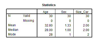
Since Age is a quantitative variable and it does not have outliers, Mean will be an appropriate measure of central tendency.
Since Sex is a nominal variable, Mode will the best measure of central tendency for the variable Sex. Mode can be used to find which is the most common category.
The variable Size_car is an ordinal variable, thus medium will be a good measure of central tendency.
Problem 4:

The average age of the male drivers who were issued speeding tickets were 32.25 and average age of the female drivers who were issued speeding tickets were 33.90. The age of Male drivers who were issued speeding tickets were less than the female drivers who were issued speeding tickets.Since the standard deviation of male drivers were more than the female drivers,we can say that the age of Male drivers who were issued speeding tickets were more spread than the female drivers who were issued speeding tickets.
Add Answer to:
A researcher randomly selected n = 30 drivers who were
issued speeding tickets in a city....
Comparing two means: When drink drove a student to statistics (Rubric included) Instructions For this assignment,...
Comparing two means: When drink drove a student to statistics (Rubric included) Instructions For this assignment, you review this week’s Learning Resources and then perform a two-sample independent t test and an ANOVA related to the dataset that was utilized in the week 2 SPSS application assignment. Import the data into SPSS; or, if you correctly saved the data file in Week 2, you may open and use that saved file to complete this assignment. Type your answers to all...
Thanks HE RESEARCHER H3 MEASURES OF CENTRAL TENDENCY 85 The Typical American Is there such a...
 Thanks
HE RESEARCHER H3 MEASURES OF CENTRAL TENDENCY 85 The Typical American Is there such a thing as a "typical" American? In this of the average American based on measures of central tendency chosen by you from the 2012 General Social Survey (GS$2012. Choose variables that you think are the most important in defining what it means to be a member of this soch ety and then choose an appropriate measure of central tendency for each variable. Use this information...
Thanks
HE RESEARCHER H3 MEASURES OF CENTRAL TENDENCY 85 The Typical American Is there such a thing as a "typical" American? In this of the average American based on measures of central tendency chosen by you from the 2012 General Social Survey (GS$2012. Choose variables that you think are the most important in defining what it means to be a member of this soch ety and then choose an appropriate measure of central tendency for each variable. Use this information...
A study was conducted to determine if a walking plus strength training exercise program results in...
A study was conducted to determine if a walking plus strength training exercise program results in a significantly greater increase in aerobic capacity as compared to a walking only exercise program. Participants are randomly selected and then randomly assigned to one of the exercise groups. Participants’ aerobic endurance was assessed at the beginning of the study and, again, after 6-months of exercise. Coding for study variables: AGE—age in years SEX—1 =male, 2=female EXERCISE—1= walking and strength training; 2 = walking;...
Creating Graphs Create a pie chart for the variable Car Color: Select the column with the...
 Creating Graphs
Create a pie chart for the variable Car Color: Select the
column with the Car variable, including the title of Car Color.
Click on Insert, and then Recommended
Charts. It should show a clustered column and click
OK. Once the chart is shown, right click on the
chart (main area) and select Change Chart Type.
Select Pie and OK. Click on the
pie slices, right click Add Data Labels, and
select Add Data Callouts. Add an appropriate
title....
Creating Graphs
Create a pie chart for the variable Car Color: Select the
column with the Car variable, including the title of Car Color.
Click on Insert, and then Recommended
Charts. It should show a clustered column and click
OK. Once the chart is shown, right click on the
chart (main area) and select Change Chart Type.
Select Pie and OK. Click on the
pie slices, right click Add Data Labels, and
select Add Data Callouts. Add an appropriate
title....
Project I (part II) Manual Problem 1: A researcher visited 30 randomly selected Starbucks locations and recorded t...
 Project I (part II) Manual Problem 1: A researcher visited 30 randomly selected Starbucks locations and recorded the number of cappuccinos sold at each coffee shop on 3/22. He summarized his data in this table: Variable Frequency 8 10 a) In this scenario, identify the following: • Variable • Individual • Sample • How many Starbucks locations sold at least 5 cappuccinos? • What percentage of Starbucks locations sold at least 5 cappuccinos? b) Draw a relative frequency histogram for...
1. A survey will be given to 50 students randomly selected from the freshmen class at...
1. A survey will be given to 50 students randomly selected from the freshmen class at UOWD A) The 50 students B) All students at UOWD C) All freshmen at UOWD D) All students at the UK universities. 2. Researchers are concerned that the average age of a certain type of a bird is decreasing implying, among other things, that more environmental measures should be taken. If X is the age of the birds sampled in a nationwide study, then...
Erika Diaz Your name Assignment 10 Correlation, Scatterplot, and Prediction (due 7/30/20 - 1/4/20)(28 pts) 1....
 Erika Diaz Your name Assignment 10 Correlation, Scatterplot, and Prediction (due 7/30/20 - 1/4/20)(28 pts) 1. A teacher hypothesizes that the more days of school student misses, the worse the student will do on a final exam (possible scores on the exam range from 0 to 20). She obtained a random sample of 12 students. The data are shown below. Student days missed Final exam score 1 3 16 2 2 17 3 5 13 4 8 7 5 4...
1. Statistical Parameters: it all the time. The data set presented in Table 1 represents a...
 1. Statistical Parameters: it all the time. The data set presented in Table 1 represents a sample of stream flows in a perennial stream for a 45-day period, These stream flows were measured using a flow meter that has a precision of t0.1 Cfs. Find the following statistical parameters for the sample data given in Table 1. A perennial stream is a stream that has water flowing in a. Central Tendency i. Mean the average value of the random variable....
A consulting firm was hired to perform a survey on people living in New York City. The survey was completed monthly for six months by 445 randomly-selected people in different boroughs. There were a n...
A consulting firm was hired to perform a survey on people living in New York City. The survey was completed monthly for six months by 445 randomly-selected people in different boroughs. There were a number of items on the survey, but six basic biographical items will be studied for this exercise. Item A in the description of the data collection instrument lists variables 1–5, which represent the respondent’s general attitude toward each of the five boroughs. Each of these variables...
Please solve it with steps 1. Statistical Parameters: it all the time. The data set presented...
 Please solve it with steps
1. Statistical Parameters: it all the time. The data set presented in Table 1 represents a sample of stream flows in a perennial stream for a 45-day period, These stream flows were measured using a flow meter that has a precision of t0.1 Cfs. Find the following statistical parameters for the sample data given in Table 1. A perennial stream is a stream that has water flowing in a. Central Tendency i. Mean the average...
Please solve it with steps
1. Statistical Parameters: it all the time. The data set presented in Table 1 represents a sample of stream flows in a perennial stream for a 45-day period, These stream flows were measured using a flow meter that has a precision of t0.1 Cfs. Find the following statistical parameters for the sample data given in Table 1. A perennial stream is a stream that has water flowing in a. Central Tendency i. Mean the average...
 Thanks
HE RESEARCHER H3 MEASURES OF CENTRAL TENDENCY 85 The Typical American Is there such a thing as a "typical" American? In this of the average American based on measures of central tendency chosen by you from the 2012 General Social Survey (GS$2012. Choose variables that you think are the most important in defining what it means to be a member of this soch ety and then choose an appropriate measure of central tendency for each variable. Use this information...
Thanks
HE RESEARCHER H3 MEASURES OF CENTRAL TENDENCY 85 The Typical American Is there such a thing as a "typical" American? In this of the average American based on measures of central tendency chosen by you from the 2012 General Social Survey (GS$2012. Choose variables that you think are the most important in defining what it means to be a member of this soch ety and then choose an appropriate measure of central tendency for each variable. Use this information...
 Creating Graphs
Create a pie chart for the variable Car Color: Select the
column with the Car variable, including the title of Car Color.
Click on Insert, and then Recommended
Charts. It should show a clustered column and click
OK. Once the chart is shown, right click on the
chart (main area) and select Change Chart Type.
Select Pie and OK. Click on the
pie slices, right click Add Data Labels, and
select Add Data Callouts. Add an appropriate
title....
Creating Graphs
Create a pie chart for the variable Car Color: Select the
column with the Car variable, including the title of Car Color.
Click on Insert, and then Recommended
Charts. It should show a clustered column and click
OK. Once the chart is shown, right click on the
chart (main area) and select Change Chart Type.
Select Pie and OK. Click on the
pie slices, right click Add Data Labels, and
select Add Data Callouts. Add an appropriate
title....
 Project I (part II) Manual Problem 1: A researcher visited 30 randomly selected Starbucks locations and recorded the number of cappuccinos sold at each coffee shop on 3/22. He summarized his data in this table: Variable Frequency 8 10 a) In this scenario, identify the following: • Variable • Individual • Sample • How many Starbucks locations sold at least 5 cappuccinos? • What percentage of Starbucks locations sold at least 5 cappuccinos? b) Draw a relative frequency histogram for...
 Erika Diaz Your name Assignment 10 Correlation, Scatterplot, and Prediction (due 7/30/20 - 1/4/20)(28 pts) 1. A teacher hypothesizes that the more days of school student misses, the worse the student will do on a final exam (possible scores on the exam range from 0 to 20). She obtained a random sample of 12 students. The data are shown below. Student days missed Final exam score 1 3 16 2 2 17 3 5 13 4 8 7 5 4...
 1. Statistical Parameters: it all the time. The data set presented in Table 1 represents a sample of stream flows in a perennial stream for a 45-day period, These stream flows were measured using a flow meter that has a precision of t0.1 Cfs. Find the following statistical parameters for the sample data given in Table 1. A perennial stream is a stream that has water flowing in a. Central Tendency i. Mean the average value of the random variable....
 Please solve it with steps
1. Statistical Parameters: it all the time. The data set presented in Table 1 represents a sample of stream flows in a perennial stream for a 45-day period, These stream flows were measured using a flow meter that has a precision of t0.1 Cfs. Find the following statistical parameters for the sample data given in Table 1. A perennial stream is a stream that has water flowing in a. Central Tendency i. Mean the average...
Please solve it with steps
1. Statistical Parameters: it all the time. The data set presented in Table 1 represents a sample of stream flows in a perennial stream for a 45-day period, These stream flows were measured using a flow meter that has a precision of t0.1 Cfs. Find the following statistical parameters for the sample data given in Table 1. A perennial stream is a stream that has water flowing in a. Central Tendency i. Mean the average...
Most questions answered within 3 hours.
-
What specific indicators can point to lack of progress for
African Americans in American society?
asked 47 minutes ago -
1-The Electrons in a beam are moving at 2.7×10⁸ m/s in an
electric field of 15000...
asked 1 hour ago -
A gas tank is a vertical cylinder. It has a radius of 1m, a
height of...
asked 1 hour ago -
Accent Software faces the following conditions. All of these
support Accent’s use of a market-penetration pricing...
asked 2 hours ago -
A mathematically inclined friend emails you the following
instructions: "Meet me in the cafeteria the first...
asked 2 hours ago -
A monopoly sells in two countries . The demand curves in the two
countries are p1...
asked 3 hours ago -
A .15kg rubber ball is bounced off a wall. Before hitting the
wall, the ball moves...
asked 4 hours ago -
A manufacturing company preparing to build a new plant is
considering three potential locations for it....
asked 4 hours ago -
B. If compound Y has approximately the same values of solubility
in toluene as compound X,...
asked 4 hours ago -
Oscar Inc. has inventory in Japan valued at 39,051,000 Yen one
year ago. One year ago...
asked 5 hours ago -
If Canada suffered from "fundamental disequilibrium," and its
government choose not to devalue its currency, a...
asked 5 hours ago -
4. How many input & output Key Value Pairs are passed into,
and emitted out of...
asked 5 hours ago