- Step 2: State what the graph is showing.
- Step 3: Describe the trend(s) or pattern(s) observed in the figure.
- Step 4: Interpret the
figure. (Write a whole paragraph for this step, connecting it to
material learned specifically in this class.)

Homework Answers
What is the graph denoting?
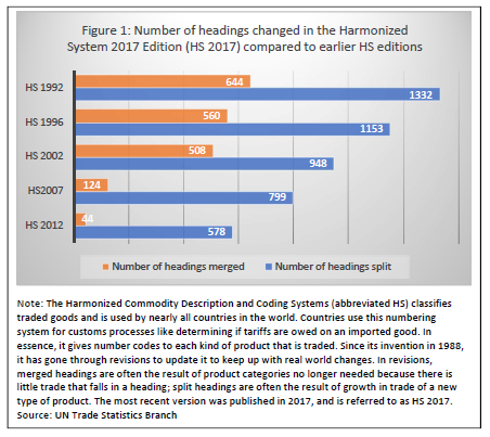
The graph shows the the Harmonized Commodity Description and Coding System, also known as the Harmonized System (HS) of tariff nomenclature is an internationally standardized system of names and numbers to classify traded products. It shows the change in the headings split and merged with each revision of the system.
Trend:
Over the years, the initital trend showed a large percentage of headings merged into categories long with split apart. However this trend has minimised over the years as more and more headings have split.
Interpretation
This maybe because of the increase in trade in electronics which has a high product differentiation. This could also be due to a larger number of countries joining the WTO with a wide variety of products.
Add Answer to:
Step 2: State what the
graph is showing.
Step 3: Describe the
trend(s) or pattern(s) observed...
Most questions answered within 3 hours.
-
Calculate the number density of argon gas at a temperature of
24C and a pressure of...
asked 2 hours ago -
Alternative
Classification
How to Estimate
Probabilities from Data? ( For continuous Attributes)
And How to generate...
asked 2 hours ago -
An explosion breaks a 20.0-kg object into three parts. The
object is initially moving at a...
asked 3 hours ago -
Calculate the approximate number of residues of Rubisco, which
is involved in carbon fixation in plants,...
asked 4 hours ago -
Other decisions about scientific claims can have a much broader
impact.ENERGYarrow-10x10.png, environment, health, security - all...
asked 5 hours ago -
I need to write a research paper and work cited about this
topic: The United States...
asked 5 hours ago -
Hello! I was wondering if I could have some help?
If the vapor pressure of carvone...
asked 5 hours ago -
An economist wants to estimate the mean per capita income (in
thousands of dollars) for a...
asked 6 hours ago -
What would be the input/output characteristic of a circuit
obtained by putting two of your 2's-complementers...
asked 6 hours ago -
In Drosophila, the transition from the syncytial blastoderm
stage to the cellular blastoderm stage is a...
asked 6 hours ago -
Project management question:
Name 3 different types of resources (hint: humans are one
type)
asked 6 hours ago -
Consider the following reaction: C 2H 2( g) + 2H 2( g) C 2H 6(
g)...
asked 6 hours ago