10. Market equilibrium
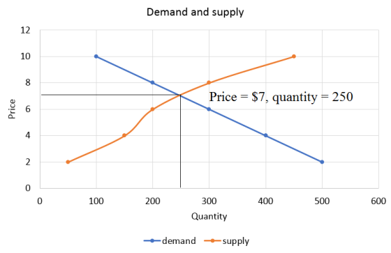
The following table shows the annual demand and supply in the market for orange juice in Chicago.

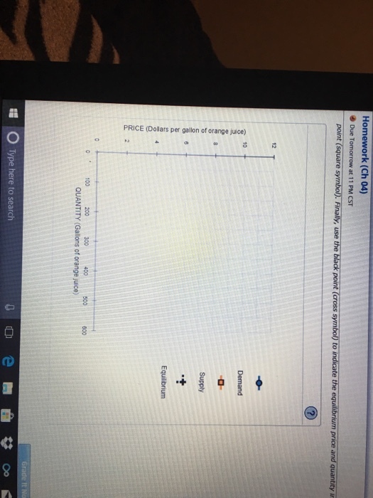
Homework Answers
The supply and demand graph is plotted below. Equilibrum occurs when price is $7 and quantity demanded and supplied are equal to each other at 250 units.
Add Answer to:
The following table shows the annual demand and supply in the market for orange juice in Chicago.
8. Market equilibrium The following table shows the annual demand and supply in the market for...
 8. Market equilibrium The following table shows the annual demand and supply in the market for shorts in Chicago. Price (Dollars per pair of shorts) Quantity Demanded (Pairs of shorts) 825 600 300 Quantity Supplied (Pairs of shorts) 150 375 525 750 Based on the preceding table, plot the demand for shorts on the following graph using the blue points (circle symbol). Next, plot the supply of shorts using the orange points (square symbol). Finally, use the black point (cross...
The following graph shows a market supply curve in orange and a market demand curve in...
 The following graph shows a market supply curve in orange and a market demand curve in blue. Suppose there is an increase in demand and an increase in supply. Adjust the following graph to reflect the new market conditions. Then, answer the questions that follow. As you can see by the changes on the graph in this case, the magnitude of the shift in the supply curve is _______ in the demand curve. Use the following table to indicate the changes in equilibrium price...
The local orange juice market in Arden-Arcade has demand and supply curves given by the following...
The local orange juice market in Arden-Arcade has demand and supply curves given by the following data. (All quantities are in thousands of gallons per week.) Price per gallon $1.75 $2.00 $2.25 $2.50 $2.75 $3.00 $3.25 Quantity demanded 10 9 8 7 6 5 4 Quantity supplied 0 4 8 12 16 20 24 What are the equilibrium price and quantity of orange juice? Group of answer choices $3.25 and 4 $2.25 and 8 $2.50 and 12 $1.75 and 10
3. Market equilibrium The following table shows the annual demand and supply in the market for...
 3. Market equilibrium The following table shows the annual demand and supply in the market for shorts in Detroit. Price Quantity Demanded (Pairs of shorts) Quantity Supplied (Pairs of shorts) (Dollars per pair of shorts) 6 1,100 200 12 800 500 18 400 700 24 200 900 30 100 1,000 On the following graph, plot the demand for shorts using the blue point (circle symbol). Next, plot the supply of shorts using the orange point (square symbol). Finally, use the...
QUESTION 30 As the price of orange juice rises, the: demand for orange juice falls. demand...
 QUESTION 30 As the price of orange juice rises, the: demand for orange juice falls. demand for grape juice rises. demand for grape juice falls. supply of orange juice falls. QUESTION 31 A decrease in the price of on-demand video streaming services such as Netflix leads to an): increase in the demand for DVD players. increase in the quantity demanded for DVDs. increase in the demand for DVDs. decrease in the demand for DVDs QUESTION 32 Which of the following...
10. Market equilibrium The following table shows the weekly demand and supply in the market for...
 10. Market equilibrium The following table shows the weekly demand and supply in the market for shorts in Philadelphia Quantity Demanded Quantity Supplied (Dollars per pair of shorts) (Pairs of shorts) (Pairs of shorts) 1,650 1,350 1,200 900 750 300 12 500 18 1,350 30 1,800 On the following graph, plot the demand for shorts using the blue point (circle symbol). Next, plot the supply of shorts using the orange point (square symbol). Finally, use the black point (cross symbol)...
The following table shows the weekly demand and supply in the market for shoes in Houston.
 6. Market equilibriumThe following table shows the weekly demand and supply in the market for shoes in Houston.Price (Dollars per pair of shoes)Quantity Demanded (Pairs of shoes)Quantity Supplied (Pairs of shoes)201,1002004090040060800500806009001005001,200On the following graph, plot the demand for shoes using the blue point (circle symbol). Next, plot the supply of shoes using the orange point (square symbol). Finally, use the black point (cross symbol) to indicate the equilibrium price and quantity in the market for shoes.
9. Shifts in supply or demand II The following graph shows the market for...
 1)9. Shifts in supply or demand IIThe following graph shows the market for cakes in Miami, where there are over 1,000 bakeries at any given moment. Suppose the price of flour, a major ingredient in cakes, suddenly increases.Show the effect of this change on the market for cakes by shifting one or both of the curves on the following graph, holding all else constant.2)10. Market equilibriumThe following table shows the annual demand and supply in the market for shoes in...
2. Price controls in the Florida orange market The following graph shows the annual market for...
 2. Price controls in the Florida orange market The following graph shows the annual market for Florida oranges, which are sold in units of 90-pound boxes. Use the graph input tool to help you answer the following questions. You will not be graded on any changes you make to this graph. Note: Once you enter a value in a white field, the graph and any corresponding amounts in each grey field will change accordingly. In this market, the equilibrium price is _______ Der...
2. Price controls in the Florida orange market The following graph shows the annual market for...
 2. Price controls in the Florida orange market The following graph shows the annual market for Florida oranges, which are sold in units of 90-pound boxes. Use the graph input tool to help you answer the following questions. You will not be graded on any changes you make to this graph. Note: Once you enter a value in a white field, the graph and any corresponding amounts in each grey field will change accordingly. In this market, the equilibrium price is _______ per...
 8. Market equilibrium The following table shows the annual demand and supply in the market for shorts in Chicago. Price (Dollars per pair of shorts) Quantity Demanded (Pairs of shorts) 825 600 300 Quantity Supplied (Pairs of shorts) 150 375 525 750 Based on the preceding table, plot the demand for shorts on the following graph using the blue points (circle symbol). Next, plot the supply of shorts using the orange points (square symbol). Finally, use the black point (cross...
 3. Market equilibrium The following table shows the annual demand and supply in the market for shorts in Detroit. Price Quantity Demanded (Pairs of shorts) Quantity Supplied (Pairs of shorts) (Dollars per pair of shorts) 6 1,100 200 12 800 500 18 400 700 24 200 900 30 100 1,000 On the following graph, plot the demand for shorts using the blue point (circle symbol). Next, plot the supply of shorts using the orange point (square symbol). Finally, use the...
 QUESTION 30 As the price of orange juice rises, the: demand for orange juice falls. demand for grape juice rises. demand for grape juice falls. supply of orange juice falls. QUESTION 31 A decrease in the price of on-demand video streaming services such as Netflix leads to an): increase in the demand for DVD players. increase in the quantity demanded for DVDs. increase in the demand for DVDs. decrease in the demand for DVDs QUESTION 32 Which of the following...
 10. Market equilibrium The following table shows the weekly demand and supply in the market for shorts in Philadelphia Quantity Demanded Quantity Supplied (Dollars per pair of shorts) (Pairs of shorts) (Pairs of shorts) 1,650 1,350 1,200 900 750 300 12 500 18 1,350 30 1,800 On the following graph, plot the demand for shorts using the blue point (circle symbol). Next, plot the supply of shorts using the orange point (square symbol). Finally, use the black point (cross symbol)...
Most questions answered within 3 hours.
-
4. Without doing any calculations, predict whether the observed
∆T would increase, decrease or remain the...
asked 44 minutes ago -
Based on the range, which of the following sets of scores has
the greatest variability? 3,...
asked 1 hour ago -
Ripples in a pond travel at a velocity of 3 m/s with one peak
passing a...
asked 1 hour ago -
A man stands on the roof of a building of height 13.0 mm and
throws a...
asked 1 hour ago -
The extent to which assets are financed by borrowed funds and
other liabilities is indicated by:...
asked 2 hours ago -
Explain in detail
Germany is the fifth largest economy
explain what goods and services Germany specializes...
asked 3 hours ago -
The density of platinum is 21.45 g/mL. If a cube of platinum
with a mass of...
asked 3 hours ago -
Accounts Receivable
Sales
A/R Posting
Extended Sales Invoice
Packing Slip
Compare invoice to packing slip 2...
asked 3 hours ago -
Michaella, age 23, is a full-time law student and is claimed by
her parents as a...
asked 3 hours ago -
Why are polymers not typically casted into products?
asked 3 hours ago -
When rolling a die 129 times, what is the probability of rolling
a 6 no more...
asked 3 hours ago -
4. A call option currently sells for $7.75. It has a strike
price of $85 and...
asked 3 hours ago