If you have a scatter plot graph and it reads moderate positive correlation is r=0.5 When...
If you have a scatter plot graph and it reads moderate positive correlation is r=0.5
When you look at the r value how is that represented on the scatter plot?
Homework Answers
Please don't hesitate to give a "thumbs up" in case
you're satisfied with the answer
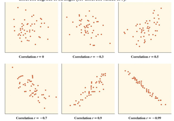
In a scatter plot a moderate value of r = .50 is basically all data points scattered around a line of best fit, but the scattering is not very random, there is a "moderate" alignment of the data points to the best-fit line.
To illustrate best this is how moderate/weak / strong r scatter plot will look like. Upper Right is +.50 correlation.
Add Answer to:
If you have a scatter plot graph and it reads moderate positive
correlation is r=0.5
When...
How would you describe, verbally, a correlation of .33, in terms of how the scatter plot...
How would you describe, verbally, a correlation of .33, in terms of how the scatter plot should look? BE SPECIFIC. Refer to the direction of the slope, generally, and whether the scatter will be widely spread out or tightly clustered around a line.
What would you use to represent correlation visually? Scatter plot Polygon Histogram Bar graph
What would you use to represent correlation visually? Scatter plot Polygon Histogram Bar graph
How do you do an X & Y scatter plot when you have one X value...
How do you do an X & Y scatter plot when you have one X value and one Y value. Im trying to create a graph that shows the x-axis (&x-value) in blue dots and on the Y-axis (y-value) in orange dots only problem the graph does not come out correctly and in the series section I leave the Y-value blank for the X-value and vice versa. When I use the Y & X value together when creating the x&y...
1. construct a scatter plot for the variables 2. compute the value of the correlation coefficient...
1. construct a scatter plot for the variables 2. compute the value of the correlation coefficient 3. give an explanation of the type nof relationship that exists between the two variables. The explanation should be a short paragraph. In this paragraph inclue the following: *say whether the is a strong positiv elinear correlation, weak positive linear correlation, strong ngative linear correlation, weak negative correlation, or no linear correlation between the two variables. *explain how you can see this from the...
You generate a scatter plot using Excel. You then have Excel plot the trend line and...
 You generate a scatter plot using Excel. You then have Excel plot the trend line and report the equation and the r2 value. The regression equation is reported as y 63.79x 13.96 and the r2 = 0.4356. What is the correlation coefficient for this data set?
For the following data (a) display the data in a scatter plot, (b) calculate the correlation...
 For the following data (a) display the data in a scatter plot, (b) calculate the correlation coefficient r, and (c) make a conclusion about the type of correlation. The ages (in years) of 6 children and the number of words in their vocabulary Age, x 1. 2 3 4 5 6 Vocabulary size, y 500 450 1350 1750 2300 2300 (a) Choose the correct scatter plot below. A. B. c. D. 2350+.. 7 2350- 2350- Vocabulary Age Vocabulary Vocabulary ....
4. Scatter plots and calculating correlation
 4. Scatter plots and calculating correlation Suppose you are given the following five pairs of scores: XY61926384110Create a scatter plot of these scores in the following diagram. For each of the five (X,Y) pairs, click on the plotting symbol (the black X) in the upper right corner of the tool, and drag it to the appropriate location on the grid. Based on your scatter plot, you would expect the correlation to be _______ .The mean X score is Mx = _______ , and...
You are given the following regression equation for a scatter plot which The displays data Weight...
 You are given the following regression equation for a scatter plot which The displays data Weight of Car (in pounds) and y = Miles per Gallon in City: for x = y = -0.006.0 + 42.825 p2 = 0.7496 (Note: The scatter plot graph is attached to the Canvas assignment as a separate document.) (a) Find the value of r based on the information given. (b) Based on your value of r, what conclusion can you make about the correlation...
13. You are given the following regression equation for a scatter plot which The displays data...
13. You are given the following regression equation for a scatter plot which The displays data for x = Weight of Car (in pounds) and y = Miles per Gallon in City: y = −0.006x + 42.825 r2 = 0.7496 (Note: The scatter plot graph is attached to the Canvas assignment as a separate document.) (a) Find the value of r based on the information given. (b) Based on your value of r, what conclusion can you make about the...
Match the linear correlation coefficient to the scatter diagram. r=-0.025 Choose the correct graph below. Oc....
 Match the linear correlation coefficient to the scatter diagram. r=-0.025 Choose the correct graph below. Oc. OD ОА Q @ Exploratory
 You generate a scatter plot using Excel. You then have Excel plot the trend line and report the equation and the r2 value. The regression equation is reported as y 63.79x 13.96 and the r2 = 0.4356. What is the correlation coefficient for this data set?
 For the following data (a) display the data in a scatter plot, (b) calculate the correlation coefficient r, and (c) make a conclusion about the type of correlation. The ages (in years) of 6 children and the number of words in their vocabulary Age, x 1. 2 3 4 5 6 Vocabulary size, y 500 450 1350 1750 2300 2300 (a) Choose the correct scatter plot below. A. B. c. D. 2350+.. 7 2350- 2350- Vocabulary Age Vocabulary Vocabulary ....
 You are given the following regression equation for a scatter plot which The displays data Weight of Car (in pounds) and y = Miles per Gallon in City: for x = y = -0.006.0 + 42.825 p2 = 0.7496 (Note: The scatter plot graph is attached to the Canvas assignment as a separate document.) (a) Find the value of r based on the information given. (b) Based on your value of r, what conclusion can you make about the correlation...
 Match the linear correlation coefficient to the scatter diagram. r=-0.025 Choose the correct graph below. Oc. OD ОА Q @ Exploratory
Most questions answered within 3 hours.
-
Calculate the pH of each of the following solutions.
0.50 M HBr
3.1×10⁻⁴ M KOH
4.2×10⁻⁵...
asked 1 hour ago -
For the year ended December 31, Depot Max’s cost of merchandise
sold was $85,600. Inventory at the...
asked 1 hour ago -
Week 10 - Professional Memo Assignment
Professional Memo Assignment
Your mission for this week, should you...
asked 2 hours ago -
Write a Python program that stores the data for each
player on the team, and it...
asked 2 hours ago -
In
the last 3 months, mike never knows when he is going to get his
allowance...
asked 2 hours ago -
Is Ca(OH)2 a Bronsted base, Lewis base, or both? Why?
asked 2 hours ago -
1A- Why don’t voters complain about U.S. tariffs on imported
sugar?
Because sugar is only a...
asked 2 hours ago -
Cash Payback Period
Primera Banco is evaluating two capital investment proposals for
a drive-up ATM kiosk,...
asked 2 hours ago -
Create a button in Swift (Xcode) that will create a charge,
create a charge using Stripe's...
asked 2 hours ago -
The reaction rate of CO and NO2 in the reaction
CO(g) + NO2(g) → CO2(g) +...
asked 2 hours ago -
Imagine that a chemist puts 6.40 mol each of
C3H8 and O2 in a 1.00-L container...
asked 2 hours ago -
How much money should be invested today in order to have $8340
at the end of...
asked 2 hours ago