Question 1. (Minitab or R)
The Environmental Protection Agency (EPA) tracks the management of certain toxic chemicals that may pose a threat to human health and the environment. U.S. facilities in different industry sectors must report annually how much of each chemical is released to the environment and/or managed through recycling, energy recovery and treatment. (A "release" of a chemical means that it is emitted to the air or water, or placed in some type of land disposal.) The information submitted by facilities is compiled in the Toxics Release Inventory (TRI). TRI helps support informed decision-making by companies, government agencies, non-governmental organizations and the public. Your data file contains the net releases of toxic chemicals in pounds per square mile for each state of the United States (from https://www.epa.gov/toxics-release-inventory-tri-program ) and whether the state is classified as red or blue politically based on the 2016 election (from http://www-personal.umich.edu/~mejn/election/2016/).
a) Describe the cases and the variables in this data set. Specify the quantitative and the categorical variables?
b) Construct a stem-and-leaf display (or stem plot) of the distribution of the net releases for all states. Preferably, but not required, use the font Courier New in Word when you paste into your report to make it look nice.
c) Describe the shape, center, and spread of the distribution of net releases.
d) Identify any suspected outliers. Based on what you know about the outlying states, explain why they are outliers.
e) Make back-to-back stem plots of the net releases by political color.
f) Write a brief comparison of the two distributions in the back to back stem plot.
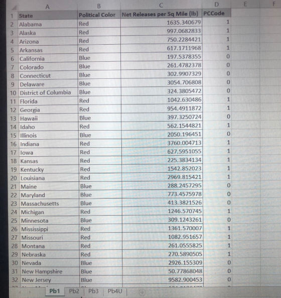

30 Nevada 2926.155309 Blue 50.77868048 31 New Hampshire 0 ue 9582.900453 32 New Jersey 33 New Mexico 0 184.2126478 0 34 New York 35 North Carolina Blue 326.766159 0 Red 1255.703922 36 North Dakota 663.5360953 37 Ohio 2618.116231 1 38 Oklahoma Red 384.7319543 39 Oregon Blue 161.7890486 0 40 Pennsylvania Red 1455.127368 41 Rhode Island Blue 419.064358 42 South Carolina 43 South Dakota Red 1252.068122 Red 83.50635735 44 Tennessee Red 2058.158047 45 Texas Red 876.5177672 46 Utah Red 2699.888726 Blue 36.9015181 0 48 Virginia 49 Washington 954.2464747 Blue 0 Blue 382.9761012 50 West Virginia Red 1298.421973 51 Wisconsin Red 571.2200275 52 Wyoming Red 209.7583389 57
Homework Answers

(b)
Stem-and-Leaf Display: Net Releases per sq Mile
Stem-and-leaf of Net Releases per sq Mile N = 51
Leaf Unit = 100
(32) 0 00011122222233333334455666778999
19 1 0022223456
9 2 006699
3 3 07
1 4
1 5
1 6
1 7
1 8
1 9 5
Note: we round the value 2 decimal places before construct stem-leaf plot.
(c)
Descriptive Statistics: Net Releases per sq Mile
Variable Mean StDev Variance Median Range IQR
Net Releases per sq Mile 1152 1507 2271938 664 9546 1059
Variable Skewness Kurtosis
Net Releases per sq Mile 3.82 19.36
Center:
Mean=1152, Median=664
Spread:
Variance=2271938, standard deviation=1507, IQR=1059, Range=9546
Shape:
Since Measure of skewness>0 so it is positively skewed.
(d)
First quartile=Q1=303, third quartile=Q3=1362, IQR=1059 then
Lower Whisker=Q1-1.5IQR=303-1.5*1059=-1285.5
Upper Whisker=Q3+1.5IQR=1362+1.5*1059= 2950.5
Maximum value=37, Minimum value=9583.
Any value lies outside the interval (-1285.5, 2950.5) treated as an outlier. Hence suspected outliers are:
3054.706808, 3760.004713, 2969.815421, 9582.900453 and the outlying states are:
Delaware, Indiana, Louisiana, New Jersey.
(e)
Stem-and-Leaf Display: Red, Blue
Stem-and-leaf of Red N = 30
Leaf Unit = 100
6 0 022223
15 0 556667899
15 1 00222234
7 1 56
5 2 0
4 2 669
1 3
1 3 7
Stem-and-leaf of Blue N = 21
Leaf Unit = 100
(17) 0 00111223333334479
4 1
4 2 09
2 3 0
1 4
1 5
1 6
1 7
1 8
1 9 5
Add Answer to:
Question 1. (Minitab or R) The Environmental Protection Agency (EPA) tracks the management of certain toxic chemicals th...
Question 1: (MINITAB or R) Let’s look at the variation of the net releases of toxic chemicals in pounds per square mile...
 Question 1: (MINITAB or R)
Let’s look at the variation of the net releases of toxic
chemicals in pounds per square mile for each state in a different
way. We are using the same data set as in lab 1 problem 1.
a) Obtain the boxplot of the entire data set (ignore political
color for now). Excel does not do this easily so use Minitab or
R.
b) Find the five-number summary, the mean, and the standard
deviation of the...
Question 1: (MINITAB or R)
Let’s look at the variation of the net releases of toxic
chemicals in pounds per square mile for each state in a different
way. We are using the same data set as in lab 1 problem 1.
a) Obtain the boxplot of the entire data set (ignore political
color for now). Excel does not do this easily so use Minitab or
R.
b) Find the five-number summary, the mean, and the standard
deviation of the...
Rate 3% 12% 14% 8% 9% 596 State Rate State 1090 | Kansas 11% Kentucky 13%...
 Rate 3% 12% 14% 8% 9% 596 State Rate State 1090 | Kansas 11% Kentucky 13% Louisiana 1296 | Maine 8% Maryland 690 590 | Michigan 890 | Minnesota 996 | Mississippi 1196 | Missouri 1390 | Montana 1090 | Nebraska 996 | Nevada 996| New Hampshire 590 796 | New Jersey 1290 | South Dakota 996 | Tennessee Alabama Alaska Arizona Arkansas California Colorado Connecticut Delaware Florida Georgia Hawaii Idaho Illinois Indiana Iowa New Mexico New York North Carolina...
Please explain how each step is performed. TABLE 1. SOFT DRINK DEMAND DATA State Cans/Capita/Yr 6-Pack...
 Please explain how each step is performed.
TABLE 1. SOFT DRINK DEMAND DATA State Cans/Capita/Yr 6-Pack Price ($) IncomelCapita ($1,000) Mean Temp. (F) Alabama Arizona Arkansas California Colorado Connecticut Delaware 200 150 237 135 1.99 1.93 15.3 18.1 25.2 16.2 1.99 242 295 64 Georgia Idaho Illinois Indiana lowa Kansas Kentucky Louisiana Maine Maryland Massachusetts Michigan Minnesota Mississippi Missouri Montana Nebraska Nevada New Hampshire New Jersey New Mexico New York North Carolina North Dakota Ohio Oklahoma Oregon Pennsylvania Rhode Island...
Please explain how each step is performed.
TABLE 1. SOFT DRINK DEMAND DATA State Cans/Capita/Yr 6-Pack Price ($) IncomelCapita ($1,000) Mean Temp. (F) Alabama Arizona Arkansas California Colorado Connecticut Delaware 200 150 237 135 1.99 1.93 15.3 18.1 25.2 16.2 1.99 242 295 64 Georgia Idaho Illinois Indiana lowa Kansas Kentucky Louisiana Maine Maryland Massachusetts Michigan Minnesota Mississippi Missouri Montana Nebraska Nevada New Hampshire New Jersey New Mexico New York North Carolina North Dakota Ohio Oklahoma Oregon Pennsylvania Rhode Island...
please answer these 2 questions !! 1. 2. A government bureau publishes the percent of adults...
 please answer these 2 questions !!
1.
2.
A government bureau publishes the percent of adults in each state and the District of Columbia who have completed a bachelor's degree. The data is provided in the accompanying table. Use this information to complete parts (a) through (c). Click the icon to view the data table. a. Use technology to construct a stem-and-leaf diagram of the percentages with one line per stem. Complete the stem-and-leat diagram below. (Type whole numbers. Use...
please answer these 2 questions !!
1.
2.
A government bureau publishes the percent of adults in each state and the District of Columbia who have completed a bachelor's degree. The data is provided in the accompanying table. Use this information to complete parts (a) through (c). Click the icon to view the data table. a. Use technology to construct a stem-and-leaf diagram of the percentages with one line per stem. Complete the stem-and-leat diagram below. (Type whole numbers. Use...
For the data below** a. Make a scatterplot, where y=mortality and x= latitude. b. Find the...
 For the data below** a. Make a scatterplot, where y=mortality
and x= latitude.
b. Find the least-squares line relating mortality (y) to
latitude (x).
c. Plot the least-squares line on the graph from part a.
d. Is the slope positive or negative? Comment on what this
means.
Latitude Mortality 33.0 34.5 state 1. Alabama 2. Arizona 3. Arkansas 4. California 5. Colorado 6. Connecticut . DeLaware 8. Florida 9. Georgia 10. Idaho 11. Illinois 12. Indiana 13. Iowa 14. Kansas...
For the data below** a. Make a scatterplot, where y=mortality
and x= latitude.
b. Find the least-squares line relating mortality (y) to
latitude (x).
c. Plot the least-squares line on the graph from part a.
d. Is the slope positive or negative? Comment on what this
means.
Latitude Mortality 33.0 34.5 state 1. Alabama 2. Arizona 3. Arkansas 4. California 5. Colorado 6. Connecticut . DeLaware 8. Florida 9. Georgia 10. Idaho 11. Illinois 12. Indiana 13. Iowa 14. Kansas...
Go back to the Statehood sheet. Add a column E called Nicknames. Use a VLOOKUP() function...
 Go back to the Statehood sheet. Add a column E called
Nicknames. Use a VLOOKUP() function to add the nicknames from the
nicknames sheet into column E of the statehood sheet. Please just
give the vlookup function to type in
State # nicknames State Delaware Pennsylvania New Jersey Georgia Connecticut Massachusetts Maryland South Carolina New Hampshire Virginia New York North Carolina Rhode Island Vermont Kentucky Tennessee Ohio Louisiana Indiana Mississippi Illinois Alabama Maine Missouri Arkansas Michigan Florida Texas lowa Wisconsin...
Go back to the Statehood sheet. Add a column E called
Nicknames. Use a VLOOKUP() function to add the nicknames from the
nicknames sheet into column E of the statehood sheet. Please just
give the vlookup function to type in
State # nicknames State Delaware Pennsylvania New Jersey Georgia Connecticut Massachusetts Maryland South Carolina New Hampshire Virginia New York North Carolina Rhode Island Vermont Kentucky Tennessee Ohio Louisiana Indiana Mississippi Illinois Alabama Maine Missouri Arkansas Michigan Florida Texas lowa Wisconsin...
Go back to the Statehood sheet. Add a column E called Nicknames. Use a VLOOKUP() function to add the nicknames from the...
 Go back to the Statehood sheet. Add a column E called Nicknames.
Use a VLOOKUP() function to add the nicknames from the nicknames
sheet into column E of the statehood sheet. plz just give me the
vlookup function to type in
State # nicknames State Delaware Pennsylvania New Jersey Georgia Connecticut Massachusetts Maryland South Carolina New Hampshire Virginia New York North Carolina Rhode Island Vermont Kentucky Tennessee Ohio Louisiana Indiana Mississippi Illinois Alabama Maine Missouri Arkansas Michigan Florida Texas lowa...
Go back to the Statehood sheet. Add a column E called Nicknames.
Use a VLOOKUP() function to add the nicknames from the nicknames
sheet into column E of the statehood sheet. plz just give me the
vlookup function to type in
State # nicknames State Delaware Pennsylvania New Jersey Georgia Connecticut Massachusetts Maryland South Carolina New Hampshire Virginia New York North Carolina Rhode Island Vermont Kentucky Tennessee Ohio Louisiana Indiana Mississippi Illinois Alabama Maine Missouri Arkansas Michigan Florida Texas lowa...
answer these 3 questions ! 1. 2. 3. Questi 2.3.119 Refer to the given frequency distribution...
 answer these 3 questions !
1.
2.
3.
Questi 2.3.119 Refer to the given frequency distribution for the top speeds, in miles per hour, for 20 cheetahs. a. Construct a table with the cumulative and cumulative relative frequencies for the data. b. Construct an ogive for the data. Click the icon to view the frequency distribution. Click the icon to view information on cumulative frequencies and ogives. a. Complete the table below. Cumulative Cumulative Relative Less Than Frequency Frequency Frequency...
answer these 3 questions !
1.
2.
3.
Questi 2.3.119 Refer to the given frequency distribution for the top speeds, in miles per hour, for 20 cheetahs. a. Construct a table with the cumulative and cumulative relative frequencies for the data. b. Construct an ogive for the data. Click the icon to view the frequency distribution. Click the icon to view information on cumulative frequencies and ogives. a. Complete the table below. Cumulative Cumulative Relative Less Than Frequency Frequency Frequency...
Create a scatterplot of Avg. Total Score vs. PPS with regression line. With Minitab, compute the...
Create a scatterplot of Avg. Total Score vs. PPS with regression line. With Minitab, compute the basic statistics needed to compute the equation of the regression line, then compute the equation by hand. (Include the Minitab print out of the basic statistics used in your computation and type the equation itself, but, remember, you do not have to include your by-hand computations in your paper.) More specifically how to do this operation on minitab express here is the data: ...
Part 3: Hypothesis Testing In 2011, the national percent of low-income working families had an ap...
Part 3: Hypothesis Testing In 2011, the national percent of low-income working families had an approximately normal distribution with a mean of 31.3% and a standard deviation of 6.2% (The Working Poor Families Project, 2011). Although it remained slow, some politicians claimed that the recovery from the Great Recession was steady and noticeable. As a result, it was believed that the national percent of low-income working families was significantly lower in 2014 than it was in 2011. To support this...
 Question 1: (MINITAB or R)
Let’s look at the variation of the net releases of toxic
chemicals in pounds per square mile for each state in a different
way. We are using the same data set as in lab 1 problem 1.
a) Obtain the boxplot of the entire data set (ignore political
color for now). Excel does not do this easily so use Minitab or
R.
b) Find the five-number summary, the mean, and the standard
deviation of the...
Question 1: (MINITAB or R)
Let’s look at the variation of the net releases of toxic
chemicals in pounds per square mile for each state in a different
way. We are using the same data set as in lab 1 problem 1.
a) Obtain the boxplot of the entire data set (ignore political
color for now). Excel does not do this easily so use Minitab or
R.
b) Find the five-number summary, the mean, and the standard
deviation of the...
 Rate 3% 12% 14% 8% 9% 596 State Rate State 1090 | Kansas 11% Kentucky 13% Louisiana 1296 | Maine 8% Maryland 690 590 | Michigan 890 | Minnesota 996 | Mississippi 1196 | Missouri 1390 | Montana 1090 | Nebraska 996 | Nevada 996| New Hampshire 590 796 | New Jersey 1290 | South Dakota 996 | Tennessee Alabama Alaska Arizona Arkansas California Colorado Connecticut Delaware Florida Georgia Hawaii Idaho Illinois Indiana Iowa New Mexico New York North Carolina...
 Please explain how each step is performed.
TABLE 1. SOFT DRINK DEMAND DATA State Cans/Capita/Yr 6-Pack Price ($) IncomelCapita ($1,000) Mean Temp. (F) Alabama Arizona Arkansas California Colorado Connecticut Delaware 200 150 237 135 1.99 1.93 15.3 18.1 25.2 16.2 1.99 242 295 64 Georgia Idaho Illinois Indiana lowa Kansas Kentucky Louisiana Maine Maryland Massachusetts Michigan Minnesota Mississippi Missouri Montana Nebraska Nevada New Hampshire New Jersey New Mexico New York North Carolina North Dakota Ohio Oklahoma Oregon Pennsylvania Rhode Island...
Please explain how each step is performed.
TABLE 1. SOFT DRINK DEMAND DATA State Cans/Capita/Yr 6-Pack Price ($) IncomelCapita ($1,000) Mean Temp. (F) Alabama Arizona Arkansas California Colorado Connecticut Delaware 200 150 237 135 1.99 1.93 15.3 18.1 25.2 16.2 1.99 242 295 64 Georgia Idaho Illinois Indiana lowa Kansas Kentucky Louisiana Maine Maryland Massachusetts Michigan Minnesota Mississippi Missouri Montana Nebraska Nevada New Hampshire New Jersey New Mexico New York North Carolina North Dakota Ohio Oklahoma Oregon Pennsylvania Rhode Island...
 please answer these 2 questions !!
1.
2.
A government bureau publishes the percent of adults in each state and the District of Columbia who have completed a bachelor's degree. The data is provided in the accompanying table. Use this information to complete parts (a) through (c). Click the icon to view the data table. a. Use technology to construct a stem-and-leaf diagram of the percentages with one line per stem. Complete the stem-and-leat diagram below. (Type whole numbers. Use...
please answer these 2 questions !!
1.
2.
A government bureau publishes the percent of adults in each state and the District of Columbia who have completed a bachelor's degree. The data is provided in the accompanying table. Use this information to complete parts (a) through (c). Click the icon to view the data table. a. Use technology to construct a stem-and-leaf diagram of the percentages with one line per stem. Complete the stem-and-leat diagram below. (Type whole numbers. Use...
 For the data below** a. Make a scatterplot, where y=mortality
and x= latitude.
b. Find the least-squares line relating mortality (y) to
latitude (x).
c. Plot the least-squares line on the graph from part a.
d. Is the slope positive or negative? Comment on what this
means.
Latitude Mortality 33.0 34.5 state 1. Alabama 2. Arizona 3. Arkansas 4. California 5. Colorado 6. Connecticut . DeLaware 8. Florida 9. Georgia 10. Idaho 11. Illinois 12. Indiana 13. Iowa 14. Kansas...
For the data below** a. Make a scatterplot, where y=mortality
and x= latitude.
b. Find the least-squares line relating mortality (y) to
latitude (x).
c. Plot the least-squares line on the graph from part a.
d. Is the slope positive or negative? Comment on what this
means.
Latitude Mortality 33.0 34.5 state 1. Alabama 2. Arizona 3. Arkansas 4. California 5. Colorado 6. Connecticut . DeLaware 8. Florida 9. Georgia 10. Idaho 11. Illinois 12. Indiana 13. Iowa 14. Kansas...
 Go back to the Statehood sheet. Add a column E called
Nicknames. Use a VLOOKUP() function to add the nicknames from the
nicknames sheet into column E of the statehood sheet. Please just
give the vlookup function to type in
State # nicknames State Delaware Pennsylvania New Jersey Georgia Connecticut Massachusetts Maryland South Carolina New Hampshire Virginia New York North Carolina Rhode Island Vermont Kentucky Tennessee Ohio Louisiana Indiana Mississippi Illinois Alabama Maine Missouri Arkansas Michigan Florida Texas lowa Wisconsin...
Go back to the Statehood sheet. Add a column E called
Nicknames. Use a VLOOKUP() function to add the nicknames from the
nicknames sheet into column E of the statehood sheet. Please just
give the vlookup function to type in
State # nicknames State Delaware Pennsylvania New Jersey Georgia Connecticut Massachusetts Maryland South Carolina New Hampshire Virginia New York North Carolina Rhode Island Vermont Kentucky Tennessee Ohio Louisiana Indiana Mississippi Illinois Alabama Maine Missouri Arkansas Michigan Florida Texas lowa Wisconsin...
 Go back to the Statehood sheet. Add a column E called Nicknames.
Use a VLOOKUP() function to add the nicknames from the nicknames
sheet into column E of the statehood sheet. plz just give me the
vlookup function to type in
State # nicknames State Delaware Pennsylvania New Jersey Georgia Connecticut Massachusetts Maryland South Carolina New Hampshire Virginia New York North Carolina Rhode Island Vermont Kentucky Tennessee Ohio Louisiana Indiana Mississippi Illinois Alabama Maine Missouri Arkansas Michigan Florida Texas lowa...
Go back to the Statehood sheet. Add a column E called Nicknames.
Use a VLOOKUP() function to add the nicknames from the nicknames
sheet into column E of the statehood sheet. plz just give me the
vlookup function to type in
State # nicknames State Delaware Pennsylvania New Jersey Georgia Connecticut Massachusetts Maryland South Carolina New Hampshire Virginia New York North Carolina Rhode Island Vermont Kentucky Tennessee Ohio Louisiana Indiana Mississippi Illinois Alabama Maine Missouri Arkansas Michigan Florida Texas lowa...
 answer these 3 questions !
1.
2.
3.
Questi 2.3.119 Refer to the given frequency distribution for the top speeds, in miles per hour, for 20 cheetahs. a. Construct a table with the cumulative and cumulative relative frequencies for the data. b. Construct an ogive for the data. Click the icon to view the frequency distribution. Click the icon to view information on cumulative frequencies and ogives. a. Complete the table below. Cumulative Cumulative Relative Less Than Frequency Frequency Frequency...
answer these 3 questions !
1.
2.
3.
Questi 2.3.119 Refer to the given frequency distribution for the top speeds, in miles per hour, for 20 cheetahs. a. Construct a table with the cumulative and cumulative relative frequencies for the data. b. Construct an ogive for the data. Click the icon to view the frequency distribution. Click the icon to view information on cumulative frequencies and ogives. a. Complete the table below. Cumulative Cumulative Relative Less Than Frequency Frequency Frequency...
Most questions answered within 3 hours.
-
Explain some different types of fungi. State the different
divisions undergo by fungi.
asked 8 minutes ago -
The shortest time that 120 C can flow through a 20 A circuit
breaker without tripping...
asked 9 minutes ago -
A software design pattern is a general, reusable solution to a
commonly occurring problem, acting as...
asked 11 minutes ago -
The mean waiting time at the drive-through of a fast-food
restaurant from the time an order...
asked 28 minutes ago -
The pitch (p) of a helix is defined as p = dn, in which n is...
asked 30 minutes ago -
Do you agree that the declining stock of social capital is the
blame for the failure...
asked 33 minutes ago -
A researcher is interested in whether coffee consumption helps
with performance on reading comprehension tasks. The...
asked 43 minutes ago -
it has been estimated since the beginning of the human race that
about 133 metric ton...
asked 49 minutes ago -
Where must Medicare prescription drug plans allow for
participants to fill their prescriptions?
asked 52 minutes ago -
Five moles of monatomic ideal gas have initial pressure 2.50 ×
103 Pa and initial volume...
asked 1 hour ago -
A resistor and the capacitor are used to control the timing in
the RC circuit of...
asked 1 hour ago -
Living in a group could bring several disadvantages to an
individual. What are some of the...
asked 1 hour ago