The following graph shows the domestic demand and domestic supply curves for lemons in New Zealand.
5. Welfare effects of free trade in an exporting country
Consider the New Zealand market for lemons.
The following graph shows the domestic demand and domestic supply curves for lemons in New Zealand. Suppose New Zealand's government currently does not allow the international trade in lemons.
Use the black point (plus symbol) to indicate the equilibrium price of a ton of lemons and the equilibrium quantity of lemons in New Zealand in the absence of international trade. Then, use the green point (triangle symbol) to shade the area representing consumer surplus in equilibrium. Finally, use the purple point (diamond symbol) to shade the area representing producer surplus in equilibrium.

Based on the previous graph, total surplus in the absence of international trade is _______ million.
The following graph shows the same domestic demand and supply curves for lemons in New Zealand. Suppose that the New Zealand government changes its international trade policy to allow the free trade of lemons. The horizontal black line (Pw) represents the world price of lemons at $800 per ton. Assume that New Zealand's entry into the world market for lemons has no effect on the world price and there are no transportation or transaction costs associated with international trade in lemons. Also assume that domestic suppliers will satisfy domestic demand as much as possible before any exporting or importing takes place.
Use the green point (triangle symbol) to shade consumer surplus, and then use the purple point (diamond symbol) to shade producer surplus. Hint: You may not need to use all the points (triangle and diamond symbols) to shade the correct areas. Do not shade the same area with multiple points.
Hint: You may not need to use all the points (triangle and diamond symbols) to shade the correct areas. Do not shade the same area with multiple points.

Homework Answers
Graph for the
domestic market for lemons:
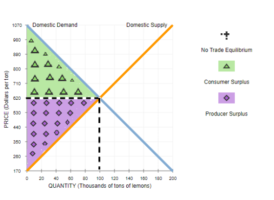
In the above image, the equilibrium price and quantity will be found where the dotted lines meet. That is,
Equilibrium price = $620
Equilibrium quantity = 100 thousand tons
Graph for the international market for lemons:

In this case, the quantity demanded domestically will go down to 60 thousand tons because the price to be paid by domestic consumers has increased to $800. However, the total quantity supplied by the producer is 140 thousand tons and to the international market is 80 thousand tons.
I hope this helps. All the best!
Add Answer to:
The following graph shows the domestic demand and domestic supply curves for lemons in New Zealand.
The following graph shows the domestic demand and domestic supply curves for lemons in New Zealand.
 The following graph shows the domestic demand and domestic supply curves for lemons in New Zealand. Suppose New Zealand's government currently does not allow international trade in lemons Use the black point (plus symbol) to indicate the equilibrium price of a ton of lemons and the equilibrium quantity of lemons in New Zealand in the absence of international trade. Then, use the green triangle (triangle symbol) to shade the area representing consumer surplus in equilibrium. Finally, use the purple triangle (diamond...
The following graph shows the domestic demand and domestic supply curves for lemons In Bolivia.
 Consider the Bolivian market for lemons. The following graph shows the domestic demand and domestic supply curves for lemons In Bolivia. Suppose Bolivia's government currently does not allow International trade In lemons. Use the black point (plus symbol) to Indicate the equilibrium price of a ton of lemons and the equilibrium quantity of lemons in Bolivia in the absence of International trade. Then, use the green triangle (triangle symbol) to shade the area representing consumer surplus In equilibrium. Finally, use the purple...
The following graph shows the domestic demand and domestic supply curves for lemons in Bolivia. Suppose Bolivia's government currently does not allow international trade in lemons.
 Consider the Bolivian market for lemons.The following graph shows the domestic demand and domestic
supply curves for lemons in Bolivia. Suppose Bolivia's government
currently does not allow international trade in lemons.Use the black point (plus symbol) to indicate the equilibrium
price of a ton of lemons and the equilibrium quantity of lemons in
Bolivia in the absence of international trade. Then, use the green
triangle (triangle symbol) to shade the area representing consumer
surplus in equilibrium. Finally, use the purple...
Consider the Bolivian market for lemons.The following graph shows the domestic demand and domestic
supply curves for lemons in Bolivia. Suppose Bolivia's government
currently does not allow international trade in lemons.Use the black point (plus symbol) to indicate the equilibrium
price of a ton of lemons and the equilibrium quantity of lemons in
Bolivia in the absence of international trade. Then, use the green
triangle (triangle symbol) to shade the area representing consumer
surplus in equilibrium. Finally, use the purple...
The following graph shows the domestic demand and domestic supply curves for lemons in Kenya. Suppose Kenya's government currently does not allow international trade in lemons.
 1. Welfare effects of free trade in an exporting country Consider the Kenyan market for lemons. The following graph shows the domestic demand and domestic supply curves for lemons in Kenya. Suppose Kenya's government currently does not allow international trade in lemons. Use the black point (plus symbol) to indicate the equilibrium price of a ton of lemons and the equilibrium quantity of lemons in Kenya in the absence of international trade. Then, use the green triangle (triangle symbol) to shade the area...
Consider the Bolivian market for lemons. The following graph shows the domestic demand and domestic supply...
 Consider the Bolivian market for lemons. The following graph shows the domestic demand and domestic supply curves for lemons in Bolivia. Suppose Bolivia's government currently does not allow international trade in lemons. Use the black point (plus symbol) to indicate the equilibrium price of a ton of lemons and the equilibrium quantity of lemons in Bolivia in the absence of international trade. Then, use the green triangle (triangle symbol) to shade the area representing consumer surplus in equilibrium. Finally, use...
The following graph shows the domestic demand and domestic supply curves for soybeans in Venezuela
 Consider the Venezuelan market for soybeans. The following graph shows the domestic demand and domestic supply curves for soybeans in Venezuela. Suppose Venezuela's government currently does not allow international trade in soybeans. Use the black point (plus symbol) to indicate the equilibrium price of a ton of soybeans and the equilibrium quantity of soybeans in Venezuela in the absence of international trade. Then, use the green triangle (triangle symbol) to shade the area representing consumer surplus in equilibrium. Finally, use the purple...
please help with the whole problem. thank you the first and second drop down menu has...
 please help with the whole problem. thank you
the first and second drop down menu has options of: increase
or decrease. and the thrird drop down menu has an option of: gain
or loss
1. Welfare effects of free trade in an exporting country Consider the New Zealand market for lemons. The following graph shows the domestic demand and domestic supply curves for lemons in New Zealand. Suppose New Zealand's government currently does not allow international trade in lemons. Use...
please help with the whole problem. thank you
the first and second drop down menu has options of: increase
or decrease. and the thrird drop down menu has an option of: gain
or loss
1. Welfare effects of free trade in an exporting country Consider the New Zealand market for lemons. The following graph shows the domestic demand and domestic supply curves for lemons in New Zealand. Suppose New Zealand's government currently does not allow international trade in lemons. Use...
Consider the Colombian market for soybeans. The following graph shows the domestic demand and domestic supply...
 Consider the Colombian market for soybeans. The following graph shows the domestic demand and domestic supply curves for soybeans in Colombia. Suppose Colombia's government currently does not allow international trade in soybeans. Use the black point (plus symbol) to indicate the equilibrium price of a ton of soybeans and the equilibrium quantity of soybeans in Colombia in the absence of international trade. Then, use the green triangle (triangle symbol) to shade the area representing consumer surplus in equilibrium. Finally, use the purple...
The following graph shows the domestic demand and domestic supply curves for tangerines in Sudan. Suppose Sudan's government currently does not allow international trade in tangerines.
 1. Welfare effects of free trade in an exporting country Consider the Sudanese market for tangerines. The following graph shows the domestic demand and domestic supply curves for tangerines in Sudan. Suppose Sudan's government currently does not allow international trade in tangerines. Use the black point (plus symbol) to indicate the equilibrium price of a ton of tangerines and the equilibrium quantity of tangerines in Sudan in the absence of international trade. Then, use the green triangle (triangle symbol) to shade the area...
The following graph shows the domestic demand and domestic supply curves for tangerines in Panama. Suppose...
 The following graph shows the domestic demand and domestic supply curves for tangerines in Panama. Suppose Panama's government currently does not allow international trade in tangerines. Use the black point (plus symbol) to indicate the equilibrium price of a ton of tangerines and the equilibrium quantity of tangerines in Panama in the absence of international trade. Then, use the green triangle (triangle symbol) to shade the area representing consumer surplus in equilibrium. Finally, use the purple triangle (diamond symbol) to...
 1. Welfare effects of free trade in an exporting country Consider the Kenyan market for lemons. The following graph shows the domestic demand and domestic supply curves for lemons in Kenya. Suppose Kenya's government currently does not allow international trade in lemons. Use the black point (plus symbol) to indicate the equilibrium price of a ton of lemons and the equilibrium quantity of lemons in Kenya in the absence of international trade. Then, use the green triangle (triangle symbol) to shade the area...
 Consider the Bolivian market for lemons. The following graph shows the domestic demand and domestic supply curves for lemons in Bolivia. Suppose Bolivia's government currently does not allow international trade in lemons. Use the black point (plus symbol) to indicate the equilibrium price of a ton of lemons and the equilibrium quantity of lemons in Bolivia in the absence of international trade. Then, use the green triangle (triangle symbol) to shade the area representing consumer surplus in equilibrium. Finally, use...
 please help with the whole problem. thank you
the first and second drop down menu has options of: increase
or decrease. and the thrird drop down menu has an option of: gain
or loss
1. Welfare effects of free trade in an exporting country Consider the New Zealand market for lemons. The following graph shows the domestic demand and domestic supply curves for lemons in New Zealand. Suppose New Zealand's government currently does not allow international trade in lemons. Use...
please help with the whole problem. thank you
the first and second drop down menu has options of: increase
or decrease. and the thrird drop down menu has an option of: gain
or loss
1. Welfare effects of free trade in an exporting country Consider the New Zealand market for lemons. The following graph shows the domestic demand and domestic supply curves for lemons in New Zealand. Suppose New Zealand's government currently does not allow international trade in lemons. Use...
 1. Welfare effects of free trade in an exporting country Consider the Sudanese market for tangerines. The following graph shows the domestic demand and domestic supply curves for tangerines in Sudan. Suppose Sudan's government currently does not allow international trade in tangerines. Use the black point (plus symbol) to indicate the equilibrium price of a ton of tangerines and the equilibrium quantity of tangerines in Sudan in the absence of international trade. Then, use the green triangle (triangle symbol) to shade the area...
 The following graph shows the domestic demand and domestic supply curves for tangerines in Panama. Suppose Panama's government currently does not allow international trade in tangerines. Use the black point (plus symbol) to indicate the equilibrium price of a ton of tangerines and the equilibrium quantity of tangerines in Panama in the absence of international trade. Then, use the green triangle (triangle symbol) to shade the area representing consumer surplus in equilibrium. Finally, use the purple triangle (diamond symbol) to...
Most questions answered within 3 hours.
-
he McCumber Corporation data for the current year:
Account
Current
year
Prior
year
Current assets
$76,200...
asked 17 seconds from now -
A ball is tossed from an upper-story window of a building. The
ball is given an...
asked 1 minute ago -
oceanic ridges represent what percentage of the earths
surface
asked 5 minutes ago -
Biological oxidation of phenylacetic acid is inhibited by
propionic acid present in wastewater. The following data...
asked 16 minutes ago -
It is essential that organizational leaders understand the
competitive, financial, and strategic advantages that can result...
asked 18 minutes ago -
Ziegler-Natta Catalysts have been successfully used to
polymerize the following monomers: (select all that apply)
a....
asked 18 minutes ago -
User documentation _____.
allows users to prepare overall documentation, such as process
descriptions and report layouts,...
asked 27 minutes ago -
A pilot flying low and slow drops a weight; it takes 2.4 s to
hit the...
asked 34 minutes ago -
LSAT test scores are normally distributed with a mean of 157 and
a standard deviation of...
asked 37 minutes ago -
You are testing a batch of pills. The manufacturer claims that
the standard deviation of their...
asked 36 minutes ago -
2.00 × 10^20 electrons flow through a cross section of a
3.60-mm-diameter iron wire in 5.00...
asked 41 minutes ago -
By exerting an effort of 115 pounds, you move a 300–pound crate
up an inclined plane...
asked 44 minutes ago