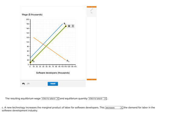
The figures below show the supply and demand for labor in the software development industry.


Homework Answers
The equilibrium wage is determined where the labour supply and the labour demanded are equal.
The equilibrium wage is 90 thousand and the quantity of 40 thousand workers.
If the government facilitate more students to study the computer programs that would increase the number of computer experts, so here the supply of the labour will increase and this is a rightward shift of the labour supply curve. When the labour supply curve shifts to the right the equilibrium wage decrease and the equilibrium quantity increases.
This is shown by the below diagram.

The marginal product of labour is the made to the total product when an additional unit of the labour is employed, an increase in the marginal product means the additional labour contributes more to the total product than the previous labour. So this is increase in the efficiency of labour, when the marginal product of labour increases the firms demand more workers, so here the demand for workers increases. This is a rightward shift of the labour demand curve.
The equilibrium wage and the quantity increases.

Add Answer to:
The figures below show the supply and demand for labor in the
software development industry.
The...
The graph on the right shows a labor supply and labor demand curve. Illustrate the impact...
 The graph on the right shows a labor supply and labor demand curve. Illustrate the impact of an efficiency wage that pushes the wage to $9 per hour. 1.) Using the point drawing tool, place a point on the graph that illustrates the market-clearing wage and quantity of labor. Label your point Market clearing.' 2.) Using the point drawing tool, place a point on the graph that illustrates the quantity of labor demanded under an efficiency wage that results in...
Use the demand and supply schedule below to answer the following questions. price of garlic per...
Use the demand and supply schedule below to answer the following questions. price of garlic per pound 10 30 50 70 90 QD of garlic 100 80- 60 40 20 QS of garlic 20 40 60 80 100 a. Graph the demand for garlic and the supply of garlic, and then indicate equilibrium in the garlic market. Instructions: Use the tools provided 'Supply' and 'Demand' to plot the supply and demand curves for this market (plot 5 points for each...
7 Change in Demand Exercise 1 The table below describes the demand for bathing suits on...
 7 Change in Demand Exercise 1 The table below describes the demand for bathing suits on a warm, summer day in the resort town of Wisconsin Dells 5 points Demand for Bathing Suits Quantity of Price Bathing Suits (dollars) Demanded eBook $45 40 35 30 25 20 60 70 80 90 100 110 120 References a. Graph the demand curve for bathing suits Instructions: Use the tool provided 'Demand' to plot the line point by point (7 points total) on...
The demand and supply schedules for a certain good are like follows: Demand Schedule &n
The demand and supply schedules for a certain good are like follows: Demand Schedule Supply Schedule Price $ Quantity Price $ Quantity 24 150 24 50 26 140 26 60 28 120 28 70 30 110 30 80 32 90 32 90 34 80 34 110 36 70 36 120 38 60 38 140 40 50 40 150 Graph and label Demand and Supply. Find the equilibrium price and quantity from the graph. What will happen if the price is...
Use the demand and supply schedule below to answer the following questions. Price of Garlic (per...
 Use the demand and supply schedule below to answer the following questions. Price of Garlic (per Quantity of Garlic Quantity of Garlic pound) Demanded Supplied $10 100 20 3080 40 50 60 70 - 40 9020 100 80 a. Graph the demand for garlic and the supply of garlic, and then indicate equilibrium in the garlic market. Instructions: Use the tools provided Supply' and 'Demand' to plot the supply and demand curves for this market (plot 5 points for each...
Use the demand and supply schedule below to answer the following questions. Price of Garlic (per...
 Use the demand and supply schedule below to answer the following questions. Price of Garlic (per Quantity of Garlic Quantity of Garlic pound) Demanded Supplied $10 100 20 30 80 40 50 60 70 60 40 20 80 100 90 a. Graph the demand for garlic and the supply of garlic, and then indicate equilibrium in the garlic market Instructions: Use the tools provided 'Supply' and 'Demand' to plot the supply and demand curves for this ma each curve). Use...
Suppose the demand for skilled military personnel is given by the curve L=160−5w, where L is...
Suppose the demand for skilled military personnel is given by the curve L=160−5w, where L is the labor demanded per day in thousands and w is the wage rate. Suppose the supply curve for skilled military personnel is given by L=5w. What is the equilibrium wage rate and equilibrium employment for skilled military personnel? The equilibrium wage rate is $16 per hour. The equilibrium quantity of labor is 80 thousand. Now suppose due to economic problems that the government imposes...
4. Minimum wage legislation The following graph shows the labor market in the fast-food industry in...
 4. Minimum wage legislation The following graph shows the labor market in the fast-food industry in the fictional town of Supersize City. tool to help you answer the following questions. You will not be graded on any changes you make to this graph. Note: Once you enter a value in a white field, the graph and any corresponding amounts in each grey field will change accordingly. Graph Input Tool Market for Labor in the Fast Food Industry 20 18 16...
* Question Completion Status: 1 Price 110 + 8 Supply 8 8 +- 8 Demand 8...
 * Question Completion Status: 1 Price 110 + 8 Supply 8 8 +- 8 Demand 8 40+ S89 + + - 10 20 30 40 50 60 70 80 90 100 110 120 130 140 150 160 170 Quantity Refer to Figure 7-22. At the equilibrium price, total surplus is a. $3,500 b. $7,000. c. $2,500. d. $1,000 Supply HT + + + + + + + + + Demand + + + + 2 + 3 + 4 +...
please anwser all questions. thank you so much! Aa Aa Undershaft Industries is a monopsonist. The following graph shows the labor supply curve it faces (labeled "S"), its marginal reven...
 please anwser all questions. thank you so much!
Aa Aa Undershaft Industries is a monopsonist. The following graph shows the labor supply curve it faces (labeled "S"), its marginal revenue product curve (labeled "MRP"), and its marginal rèsource cośt curve (labeled MRC). WAGE (Dollars per hour 50 MR 40 MRP 30 20 10 10 20 30 40 QUANTITY OF LABOR INumber of werkersl Undershaft faces an upward-sloping above its labor supply curve. labor supply curve. Therefore, its marginal resource cost...
please anwser all questions. thank you so much!
Aa Aa Undershaft Industries is a monopsonist. The following graph shows the labor supply curve it faces (labeled "S"), its marginal revenue product curve (labeled "MRP"), and its marginal rèsource cośt curve (labeled MRC). WAGE (Dollars per hour 50 MR 40 MRP 30 20 10 10 20 30 40 QUANTITY OF LABOR INumber of werkersl Undershaft faces an upward-sloping above its labor supply curve. labor supply curve. Therefore, its marginal resource cost...
 The graph on the right shows a labor supply and labor demand curve. Illustrate the impact of an efficiency wage that pushes the wage to $9 per hour. 1.) Using the point drawing tool, place a point on the graph that illustrates the market-clearing wage and quantity of labor. Label your point Market clearing.' 2.) Using the point drawing tool, place a point on the graph that illustrates the quantity of labor demanded under an efficiency wage that results in...
 7 Change in Demand Exercise 1 The table below describes the demand for bathing suits on a warm, summer day in the resort town of Wisconsin Dells 5 points Demand for Bathing Suits Quantity of Price Bathing Suits (dollars) Demanded eBook $45 40 35 30 25 20 60 70 80 90 100 110 120 References a. Graph the demand curve for bathing suits Instructions: Use the tool provided 'Demand' to plot the line point by point (7 points total) on...
 Use the demand and supply schedule below to answer the following questions. Price of Garlic (per Quantity of Garlic Quantity of Garlic pound) Demanded Supplied $10 100 20 3080 40 50 60 70 - 40 9020 100 80 a. Graph the demand for garlic and the supply of garlic, and then indicate equilibrium in the garlic market. Instructions: Use the tools provided Supply' and 'Demand' to plot the supply and demand curves for this market (plot 5 points for each...
 Use the demand and supply schedule below to answer the following questions. Price of Garlic (per Quantity of Garlic Quantity of Garlic pound) Demanded Supplied $10 100 20 30 80 40 50 60 70 60 40 20 80 100 90 a. Graph the demand for garlic and the supply of garlic, and then indicate equilibrium in the garlic market Instructions: Use the tools provided 'Supply' and 'Demand' to plot the supply and demand curves for this ma each curve). Use...
 4. Minimum wage legislation The following graph shows the labor market in the fast-food industry in the fictional town of Supersize City. tool to help you answer the following questions. You will not be graded on any changes you make to this graph. Note: Once you enter a value in a white field, the graph and any corresponding amounts in each grey field will change accordingly. Graph Input Tool Market for Labor in the Fast Food Industry 20 18 16...
 * Question Completion Status: 1 Price 110 + 8 Supply 8 8 +- 8 Demand 8 40+ S89 + + - 10 20 30 40 50 60 70 80 90 100 110 120 130 140 150 160 170 Quantity Refer to Figure 7-22. At the equilibrium price, total surplus is a. $3,500 b. $7,000. c. $2,500. d. $1,000 Supply HT + + + + + + + + + Demand + + + + 2 + 3 + 4 +...
 please anwser all questions. thank you so much!
Aa Aa Undershaft Industries is a monopsonist. The following graph shows the labor supply curve it faces (labeled "S"), its marginal revenue product curve (labeled "MRP"), and its marginal rèsource cośt curve (labeled MRC). WAGE (Dollars per hour 50 MR 40 MRP 30 20 10 10 20 30 40 QUANTITY OF LABOR INumber of werkersl Undershaft faces an upward-sloping above its labor supply curve. labor supply curve. Therefore, its marginal resource cost...
please anwser all questions. thank you so much!
Aa Aa Undershaft Industries is a monopsonist. The following graph shows the labor supply curve it faces (labeled "S"), its marginal revenue product curve (labeled "MRP"), and its marginal rèsource cośt curve (labeled MRC). WAGE (Dollars per hour 50 MR 40 MRP 30 20 10 10 20 30 40 QUANTITY OF LABOR INumber of werkersl Undershaft faces an upward-sloping above its labor supply curve. labor supply curve. Therefore, its marginal resource cost...
Most questions answered within 3 hours.
-
Write the ionic equations for the first stage of salts
hydrolysis.
Anion, Cation?
Na2S
NiSO4
K2SO4...
asked 15 minutes ago -
suppose there is a normally distributed population with a mean of
250 and a standard deviation...
asked 59 minutes ago -
Question Three
Suppose you as project manager are using the Waterfall
development methodology on a large...
asked 1 hour ago -
Which statement is not true about welfare in Canada?
A.Benefits typically vary based on one's ability...
asked 2 hours ago -
Please help me with FLOWCHART and UML diagram for class,
thank you!
#include <iostream>
#include <fstream>...
asked 3 hours ago -
3. Describe the “logic circuit” of the Lac operon. Which
proteins are bound or not to...
asked 3 hours ago -
Ayesha’s adjusted gross income is $60,000 in 2019. She donated a
piece of artwork with a...
asked 3 hours ago -
For Dijkstra’s shortest path algorithm:
a. Give the Big-O time for Dijkstra’s shortest path algorithm
and...
asked 3 hours ago -
Phosphorus violates the 'octet rule' in biological molecules,
forming more covalent bonds than expected based on...
asked 3 hours ago -
A 1.3 eV electron has a 10-4 probability of tunneling
through a 2.4 eV potential barrier....
asked 3 hours ago -
What is the one ingredient that is common to being successful
with all stakeholders?
profit
trust...
asked 3 hours ago -
Write an assembly language 32 bit program that reads in lines of
text by a .txt...
asked 3 hours ago