
Homework Answers
Add Answer to:
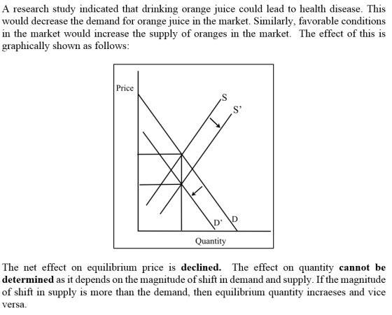
30
The graph below depicts the market for oranges. a. Use the diagram below to illustrate...
The graph below depicts the market for cars. a. Use the diagram below to illustrate an...
 The graph below depicts the market for cars. a. Use the diagram below to illustrate an increase in the price of steel Instructions: Use the tool provided 'New line' to draw a new line that reflects the market effect of this event. Plot only the endpoints of the line. Market for Cars Tools New line D, Quantity of cars b. If the price of steel increases, the ((Click to select) and the equillbrium quantity to Click to selectl cars will...
26 The graph below depicts the market for gasoline. a. Use the diagram below to illustrate...
 26
The graph below depicts the market for gasoline. a. Use the diagram below to illustrate that consumers expect the price of gasoline to decrease in the future Instructions: Use the tool provided 'New line' to draw a new line that reflects the market effect of this event. Plot only the endpoints of the line. Market for Gasoline Tools s1 New line D1 Thousands of gallons b. This expectation will cause the equilibrium price to Click to select) and the...
26
The graph below depicts the market for gasoline. a. Use the diagram below to illustrate that consumers expect the price of gasoline to decrease in the future Instructions: Use the tool provided 'New line' to draw a new line that reflects the market effect of this event. Plot only the endpoints of the line. Market for Gasoline Tools s1 New line D1 Thousands of gallons b. This expectation will cause the equilibrium price to Click to select) and the...
27 The graph below depicts the market for pretzels. a. Use the diagram below to illustrate...
 27
The graph below depicts the market for pretzels. a. Use the diagram below to illustrate an increase in the price of potato chips Instructions: Use the tool provided 'New line' to draw a new line that reflects the market effect of this event. Plot only the endpoints of the line. Market for Pretzels Tools S1 New line 01 Quantity of pretzels b. If the price of potato chips increases, the Click to select) pretzels wll Click to select). This...
27
The graph below depicts the market for pretzels. a. Use the diagram below to illustrate an increase in the price of potato chips Instructions: Use the tool provided 'New line' to draw a new line that reflects the market effect of this event. Plot only the endpoints of the line. Market for Pretzels Tools S1 New line 01 Quantity of pretzels b. If the price of potato chips increases, the Click to select) pretzels wll Click to select). This...
29 The graph below depicts the market for shoes. a. Use the diagram below to illustrate...
 29
The graph below depicts the market for shoes. a. Use the diagram below to illustrate that a less expensive material is developed for the soles of shoes. Instructions: Use the tool provided 'New line' to draw a new line that reflects the market effect of this event. Plot only the endpoints of the line. Market for Shoes Tools New line 0 Quantity of shoes b. If a new, less expensive material is developed for the soles of shoes, the「TRT-e...
29
The graph below depicts the market for shoes. a. Use the diagram below to illustrate that a less expensive material is developed for the soles of shoes. Instructions: Use the tool provided 'New line' to draw a new line that reflects the market effect of this event. Plot only the endpoints of the line. Market for Shoes Tools New line 0 Quantity of shoes b. If a new, less expensive material is developed for the soles of shoes, the「TRT-e...
25 The graph below depicts the market for the market for an inferior good a. Use...
 25
The graph below depicts the market for the market for an inferior good a. Use the diagram below to illustrate an increase in the income of buyers Instructions: Use the tool provided 'New line' to draw a new line that reflects the market effect of this event. Plot only the endpoints of the line. Market for Good A Tools S, New ine 0, Quantity b. This increase in the income of buyers will cause the equilibrium price to Click...
25
The graph below depicts the market for the market for an inferior good a. Use the diagram below to illustrate an increase in the income of buyers Instructions: Use the tool provided 'New line' to draw a new line that reflects the market effect of this event. Plot only the endpoints of the line. Market for Good A Tools S, New ine 0, Quantity b. This increase in the income of buyers will cause the equilibrium price to Click...
29 The graph below depicts the market for shoes. a. Use the diagram below to illustrate...
 29
The graph below depicts the market for shoes. a. Use the diagram below to illustrate that a less expensive material is developed for the soles of shoes. Instructions: Use the tool provided 'New line' to draw a new line that reflects the market effect of this event. Plot only the endpoints of the line. Market for Shoes Tools New line Q1 Quantity of shoes
29
The graph below depicts the market for shoes. a. Use the diagram below to illustrate that a less expensive material is developed for the soles of shoes. Instructions: Use the tool provided 'New line' to draw a new line that reflects the market effect of this event. Plot only the endpoints of the line. Market for Shoes Tools New line Q1 Quantity of shoes
The graph below shows the market for mandarin oranges in Odin for the month of November...
 The graph below shows the market for mandarin oranges in Odin for the month of November (in thousands of kilos). s Tools Price 100 200 300 400 500 600 700 800 900 0 Quantity per month Suppose that in December the demand of mandarin oranges increases by 250 while the supply increases by 100. a) Draw the new curves D2 and S2 In graph above. Plot only the endpoints of the curve above and position those points on the edges...
The graph below depicts an economy where an increase in aggregate demand has caused Inflation. The...
 The graph below depicts an economy where an increase in aggregate demand has caused Inflation. The economy's current level of real GDP (Y2) is above Its long-run equilibrium, which is illustrated by the long-run aggregate supply curve (LRAS), and a price level (P2) above the equilibrium value of Pe. Without any fiscal policy, we expect the economy to eventually return to full employment on its own. Use the graph below to illustrate this process. Instructions: Use the tool provided to...
The following graph shows the annual market for Florida oranges, which are sold in units of 90-pound boxes.
 3. Price controls in the Florida orange market The following graph shows the annual market for Florida oranges, which are sold in units of 90-pound boxes. Use the graph input tool to help you answer the following questions. You will not be graded on any changes you make to this graph. Note: Once you enter a value in a white field, the graph and any corresponding amounts in each grey field will change accordingly. In this market, the equilibrium price is $_______ per...
The following graph shows the annual market for Florida oranges, which are sold in units of 90-pound boxes.
 2. Price controls in the Florida orange market The following graph shows the annual market for Florida oranges, which are sold in units of 90-pound boxes. Use the graph input tool to help you answer the following questions. You will not be graded on any changes you make to this graph. Note: Once you enter a value in a white field, the graph and any corresponding amounts in each grey field will change accordingly. In this market, the equilibrium price is _______ per...
 The graph below depicts the market for cars. a. Use the diagram below to illustrate an increase in the price of steel Instructions: Use the tool provided 'New line' to draw a new line that reflects the market effect of this event. Plot only the endpoints of the line. Market for Cars Tools New line D, Quantity of cars b. If the price of steel increases, the ((Click to select) and the equillbrium quantity to Click to selectl cars will...
 26
The graph below depicts the market for gasoline. a. Use the diagram below to illustrate that consumers expect the price of gasoline to decrease in the future Instructions: Use the tool provided 'New line' to draw a new line that reflects the market effect of this event. Plot only the endpoints of the line. Market for Gasoline Tools s1 New line D1 Thousands of gallons b. This expectation will cause the equilibrium price to Click to select) and the...
26
The graph below depicts the market for gasoline. a. Use the diagram below to illustrate that consumers expect the price of gasoline to decrease in the future Instructions: Use the tool provided 'New line' to draw a new line that reflects the market effect of this event. Plot only the endpoints of the line. Market for Gasoline Tools s1 New line D1 Thousands of gallons b. This expectation will cause the equilibrium price to Click to select) and the...
 27
The graph below depicts the market for pretzels. a. Use the diagram below to illustrate an increase in the price of potato chips Instructions: Use the tool provided 'New line' to draw a new line that reflects the market effect of this event. Plot only the endpoints of the line. Market for Pretzels Tools S1 New line 01 Quantity of pretzels b. If the price of potato chips increases, the Click to select) pretzels wll Click to select). This...
27
The graph below depicts the market for pretzels. a. Use the diagram below to illustrate an increase in the price of potato chips Instructions: Use the tool provided 'New line' to draw a new line that reflects the market effect of this event. Plot only the endpoints of the line. Market for Pretzels Tools S1 New line 01 Quantity of pretzels b. If the price of potato chips increases, the Click to select) pretzels wll Click to select). This...
 29
The graph below depicts the market for shoes. a. Use the diagram below to illustrate that a less expensive material is developed for the soles of shoes. Instructions: Use the tool provided 'New line' to draw a new line that reflects the market effect of this event. Plot only the endpoints of the line. Market for Shoes Tools New line 0 Quantity of shoes b. If a new, less expensive material is developed for the soles of shoes, the「TRT-e...
29
The graph below depicts the market for shoes. a. Use the diagram below to illustrate that a less expensive material is developed for the soles of shoes. Instructions: Use the tool provided 'New line' to draw a new line that reflects the market effect of this event. Plot only the endpoints of the line. Market for Shoes Tools New line 0 Quantity of shoes b. If a new, less expensive material is developed for the soles of shoes, the「TRT-e...
 25
The graph below depicts the market for the market for an inferior good a. Use the diagram below to illustrate an increase in the income of buyers Instructions: Use the tool provided 'New line' to draw a new line that reflects the market effect of this event. Plot only the endpoints of the line. Market for Good A Tools S, New ine 0, Quantity b. This increase in the income of buyers will cause the equilibrium price to Click...
25
The graph below depicts the market for the market for an inferior good a. Use the diagram below to illustrate an increase in the income of buyers Instructions: Use the tool provided 'New line' to draw a new line that reflects the market effect of this event. Plot only the endpoints of the line. Market for Good A Tools S, New ine 0, Quantity b. This increase in the income of buyers will cause the equilibrium price to Click...
 29
The graph below depicts the market for shoes. a. Use the diagram below to illustrate that a less expensive material is developed for the soles of shoes. Instructions: Use the tool provided 'New line' to draw a new line that reflects the market effect of this event. Plot only the endpoints of the line. Market for Shoes Tools New line Q1 Quantity of shoes
29
The graph below depicts the market for shoes. a. Use the diagram below to illustrate that a less expensive material is developed for the soles of shoes. Instructions: Use the tool provided 'New line' to draw a new line that reflects the market effect of this event. Plot only the endpoints of the line. Market for Shoes Tools New line Q1 Quantity of shoes
 The graph below shows the market for mandarin oranges in Odin for the month of November (in thousands of kilos). s Tools Price 100 200 300 400 500 600 700 800 900 0 Quantity per month Suppose that in December the demand of mandarin oranges increases by 250 while the supply increases by 100. a) Draw the new curves D2 and S2 In graph above. Plot only the endpoints of the curve above and position those points on the edges...
 The graph below depicts an economy where an increase in aggregate demand has caused Inflation. The economy's current level of real GDP (Y2) is above Its long-run equilibrium, which is illustrated by the long-run aggregate supply curve (LRAS), and a price level (P2) above the equilibrium value of Pe. Without any fiscal policy, we expect the economy to eventually return to full employment on its own. Use the graph below to illustrate this process. Instructions: Use the tool provided to...
 3. Price controls in the Florida orange market The following graph shows the annual market for Florida oranges, which are sold in units of 90-pound boxes. Use the graph input tool to help you answer the following questions. You will not be graded on any changes you make to this graph. Note: Once you enter a value in a white field, the graph and any corresponding amounts in each grey field will change accordingly. In this market, the equilibrium price is $_______ per...
Most questions answered within 3 hours.
-
1. Which region has taken the lead in the world of
e-waste handling?
a) European Union...
asked 1 minute ago -
If you’re standing at the bottom of a hill and asked to evaluate
it while being...
asked 8 minutes ago -
A 8.15- g bullet from a 9-mm pistol has a velocity of 366.0 m/s.
It strikes...
asked 1 hour ago -
The outstanding bonds of Alpha Extracts have a yield to maturity
of 7.4 percent and a...
asked 1 hour ago -
The Problem: The Case of the Harmonizing Vacations
Your CEO is exploring partnering with a European...
asked 2 hours ago -
A chemical equation is balanced by adding coefficients in front
of some formulas so that the...
asked 2 hours ago -
From the literature (reference your sources): What are the
lattice parameters of calcite and aragonite? Why...
asked 3 hours ago -
Your system is rejecting the question am asking which is
preceded by a case study. It...
asked 3 hours ago -
3. On January 2, 2000, Larry creates a trust with himself as
trustee. Larry as trustee...
asked 3 hours ago -
A member of the volleyball team spikes the ball. During this
process, she changes the velocity...
asked 3 hours ago -
Are adult gamers less likely to use a gaming console (Xbox,
PlayStation, Wii, etc...) than teen...
asked 4 hours ago -
The University of
Texas recently reported that 43% of college students aged 18-24
would spend their...
asked 4 hours ago