

Homework Answers
Profit maximization for a natural monopolist is at the
intersection of MR and MC and extended to the demand curve. Natural
monopolist is a price taker and can sell more if the price is
reduced. He will face downward sloping demand curve.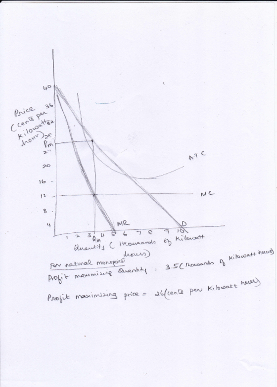
A natural monopolist enjoys monopoly over a scarce resource and there is room only for one player in the industry. Due to high costs of operating in the industry, the natual monopolist will be able to enjoy the economies of scale. The ATC will be diminishing. So statements 2,3, and 4 are true.
False. The monopolist will be able to earn normal profit, because the regulated price will be equal to ATC.
Add Answer to:
8. Natural monopoly analysis The following graph shows the demand (D) for electricity services in the...
The following graph shows the demand (D) for electricity services in the imaginary town of Utilityburg.
 5. Natural monopoly analysisThe following graph shows the demand (D) for electricity
services in the imaginary town of Utilityburg. The graph also shows
the marginal revenue (MR) curve, the marginal cost (MC) curve, and
the average total cost (ATC) curve for the local electricity
company, a natural monopolist.On the following graph, use the black point (plus symbol) to
indicate the profit-maximizing price and quantity for this natural
monopolist.On the following graph, use the black point (plus symbol) to indicate the...
5. Natural monopoly analysisThe following graph shows the demand (D) for electricity
services in the imaginary town of Utilityburg. The graph also shows
the marginal revenue (MR) curve, the marginal cost (MC) curve, and
the average total cost (ATC) curve for the local electricity
company, a natural monopolist.On the following graph, use the black point (plus symbol) to
indicate the profit-maximizing price and quantity for this natural
monopolist.On the following graph, use the black point (plus symbol) to indicate the...
The following graph shows the demand (D) for gas services in the imaginary town of Utilityburg
 2. Natural monopoly analysis The following graph shows the demand (D) for gas services in the imaginary town of Utilityburg. The graph also shows the marginal revenue (MR) curve, the marginal cost (MC) curve, and the average total cost (ATC) curve for the local gas company, a natural monopolist. On the following graph, use the black point (plus symbol) to indicate the profit maximizing price and quantity for this natural monopolist.
The following graph shows the demand (D) for electricity services in the imaginary town of Utilityburg.
 8. Natural monopoly analysis The following graph shows the demand (D) for electricity services in the imaginary town of Utilityburg. The graph also shows the marginal revenue (MR) curve, the marginal cost (MC) curve, and the average total cost (ATC) curve for the local electricity company, a natural monopolist. On the following graph, use the black point (plus symbol) to indicate the profit-maximizing price and quantity for this natural monopolist. Which of the following statements are true about this natural monopoly? Check all...
8. Natural monopoly analysis The following graph shows thedemand (D) for gas services in the...
 8. Natural monopoly analysis The following graph shows the demand (D) for gas services in the imaginary town of Utilityburg. The graph also shows the marginal revenue (MR) curve, the marginal cost (MC) curve, and the average total cost (ATC) curve for the local gas company, a natural monopolist.On the following graph, use the black point (plus symbol) to indicate the profit-maximizing price and quantity for this natural monopolist.Which of the following statements are true about this natural monopoly? Check all that...
Need help with this problem. Where do i plot the monopoly outcome on the graph and...
 Need help with this problem. Where do i plot the monopoly
outcome on the graph and also answering the following questions. I
will rate. thanks!
8. Natural monopoly analysis The following graph shows the demand (D) for cable services in the imaginary town of Utilityburg. The graph also shows the marginal revenue (MR) curve, the marginal cost (MC) curve, and the average total cost (ATC) curve for the local cable company, a natural monopolist. On the following graph, use the...
Need help with this problem. Where do i plot the monopoly
outcome on the graph and also answering the following questions. I
will rate. thanks!
8. Natural monopoly analysis The following graph shows the demand (D) for cable services in the imaginary town of Utilityburg. The graph also shows the marginal revenue (MR) curve, the marginal cost (MC) curve, and the average total cost (ATC) curve for the local cable company, a natural monopolist. On the following graph, use the...
8. Natural monopoly analysis
8. Natural monopoly analysisThe following graph shows the demand (D) for cable services in the imaginary town of Utilityburg. The graph also shows the marginal revenue (MR) curve, the marginal cost (MC) curve, and the average total cost (ATC) curve for the local cable company, a natural monopolist.On the following graph, use the black point (plus symbol) to indicate the profit-maximizing price and quantity for this natural monopolist.Monopoly Outcome024681012141618201009080706050403020100PRICE (Dollars per subscription)QUANTITY (Number of subscriptions)DMRMCATCWhich of the following statements are...
The following graph shows the demand (D) for cable services in the imaginary town of Utilityburg.
 8. Natural monopoly analysisThe following graph shows the demand (D) for cable services in
the imaginary town of Utilityburg. The graph also shows the
marginal revenue (MR) curve, the marginal cost (MC) curve, and the
average total cost (ATC) curve for the local cable company, a
natural monopolist.On the following graph, use the black point (plus symbol) to
indicate the profit-maximizing price and quantity for this natural
monopolist. Which of the following statements are true about this natural monopoly? Check all...
8. Natural monopoly analysisThe following graph shows the demand (D) for cable services in
the imaginary town of Utilityburg. The graph also shows the
marginal revenue (MR) curve, the marginal cost (MC) curve, and the
average total cost (ATC) curve for the local cable company, a
natural monopolist.On the following graph, use the black point (plus symbol) to
indicate the profit-maximizing price and quantity for this natural
monopolist. Which of the following statements are true about this natural monopoly? Check all...
The following graph shows the demand (D) for gas services in a particular town. The graph...
 The following graph shows the demand (D) for gas services in a particular town. The graph also shows the marginal revenue (MR) curve, the marginal cost (MC) curve, and the average total cost (ATC) curve for the local gas company, a natural monopolist. PRICE (Dollars per hundred cubic feet) P4 ATC P3 P2 P1 MC MR I 01 02 03 QUANTITY (Hundreds of cubic feet) Based solely on the graph, which of the following principal types of barriers to entry...
The following graph shows the demand (D) for cable services in a particular town. The graph...
 The following graph shows the demand (D) for cable services in a particular town. The graph also shows the marginal revenue (MR) curve, the marginal cost (MC) curve, and the average total cost (ATC) curve for the local cable company, a natural monopolist. PRICE AND COSTS (Dollars per subscription P4 ATC PI Mc MR 1 02 03 QUANTITY İ Number of subscriptions! Based solely on the graph, which of the following prinopal tvpes of barriers to entry is the natural...
Consider the local telephone company, a natural monopoly. The following graph shows the demand curve for...
 Consider the local telephone company, a natural monopoly. The following graph shows the demand curve for phone services, the company's marginal revenue curve (labeled MR), its marginal cost curve (labeled MC), and its average total cost curve (labeled ATC). You can hover over the points on the graph to see their exact coordinates. PRICE, COST, MR (Dollars per month) 100 90 80 70 60 Demand 50 40 30 ATC 20 MC 10 MR 54 60 30 36 42 48 0...
 Need help with this problem. Where do i plot the monopoly
outcome on the graph and also answering the following questions. I
will rate. thanks!
8. Natural monopoly analysis The following graph shows the demand (D) for cable services in the imaginary town of Utilityburg. The graph also shows the marginal revenue (MR) curve, the marginal cost (MC) curve, and the average total cost (ATC) curve for the local cable company, a natural monopolist. On the following graph, use the...
Need help with this problem. Where do i plot the monopoly
outcome on the graph and also answering the following questions. I
will rate. thanks!
8. Natural monopoly analysis The following graph shows the demand (D) for cable services in the imaginary town of Utilityburg. The graph also shows the marginal revenue (MR) curve, the marginal cost (MC) curve, and the average total cost (ATC) curve for the local cable company, a natural monopolist. On the following graph, use the...
 The following graph shows the demand (D) for gas services in a particular town. The graph also shows the marginal revenue (MR) curve, the marginal cost (MC) curve, and the average total cost (ATC) curve for the local gas company, a natural monopolist. PRICE (Dollars per hundred cubic feet) P4 ATC P3 P2 P1 MC MR I 01 02 03 QUANTITY (Hundreds of cubic feet) Based solely on the graph, which of the following principal types of barriers to entry...
 The following graph shows the demand (D) for cable services in a particular town. The graph also shows the marginal revenue (MR) curve, the marginal cost (MC) curve, and the average total cost (ATC) curve for the local cable company, a natural monopolist. PRICE AND COSTS (Dollars per subscription P4 ATC PI Mc MR 1 02 03 QUANTITY İ Number of subscriptions! Based solely on the graph, which of the following prinopal tvpes of barriers to entry is the natural...
 Consider the local telephone company, a natural monopoly. The following graph shows the demand curve for phone services, the company's marginal revenue curve (labeled MR), its marginal cost curve (labeled MC), and its average total cost curve (labeled ATC). You can hover over the points on the graph to see their exact coordinates. PRICE, COST, MR (Dollars per month) 100 90 80 70 60 Demand 50 40 30 ATC 20 MC 10 MR 54 60 30 36 42 48 0...
Most questions answered within 3 hours.
-
1,1-dimethylcyclorohexane reacts with single bromine atom
asked 6 minutes ago -
The completed Lewis structure of CO2 contains a total
of 0,1,2,3,4,5,6,7,8 covalent bonds
and 0,1,2,3,4,5,6,7,8 lone pairs.
NOTE:...
asked 12 minutes ago -
A 0.0510 M solution of an organic acid has an
[H+] of 7.50×10⁻⁴M .
What is...
asked 9 minutes ago -
what is the profit-maximizing output condition that a
monopolistically competitive firm must satisfy? a) price charged...
asked 14 minutes ago -
Consider the set of ordered pairs shown below. Assuming that the
regression equation is y=3.513+0.429x and...
asked 35 minutes ago -
1. (A) Write two
structural (constitutional)
isomers of C4H8F2?
Please show all of
the
asked 38 minutes ago -
Objective: Practice converting a Boolean logic
expression into it’s truth table and to show the implementation...
asked 34 minutes ago -
1) Name the three holes located in the greater wing of the
sphenoid bone in order...
asked 38 minutes ago -
For the following reaction set-up, which type of hydrocarbon
product would form? 1,4-hexadiene + two Cl2...
asked 41 minutes ago -
Consider the following method that is intended to determine if
the double values d1 and d2...
asked 53 minutes ago -
could someone please post clear drawings of the three structures
in the equilibrium mixture of D-glucose...
asked 1 hour ago -
Using the Properties of Order show that 5n5 +
4n4 + 6n3 + 2n2+ n +...
asked 1 hour ago