Python
● DOS R21 PROBE 0 500 1000 1500 2000 2500 Attack number detected
Homework Answers
Hello there, please make sure you have pandas, matplotlib and sklearn installed on your system.
----------------------------------------------------------------------------------------------------------------
import pandas as pd
import matplotlib.pyplot as plt
from sklearn.preprocessing import normalize
def freq_scatter_plot(filename):
df = pd.read_csv(filename)
columns = list(df.columns)
### x, y
x = list(range(len(df.index)))
y = df[columns[-1]].values
## size
marker_size = df[columns[2]].values
## color
colors = {'dos':'y', 'u2r':'g', 'r21':'b',
'probe':'r'}
attack_type = list(df[columns[1]].values)
## set plot
fig = plt.figure(figsize=(10, 5), dpi=100)
ax = fig.add_subplot(1, 1, 1)
for i in range(len(df.index)):
ax.scatter(x[i], y[i],
s=marker_size[i], c=colors[attack_type[i]])
ax.set_xlabel('Attack number detected')
ax.set_ylabel('Attack frequency')
plt.legend(markerscale=0.3)
plt.show()
---------------------------------------------------------------
If you have any doubts please use comment section!
Add Answer to:
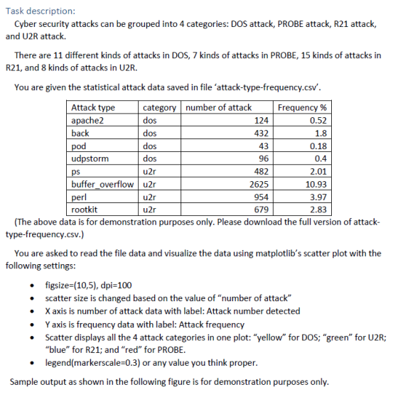
Task description: Cyber security attacks can be grouped into 4 categories: DOS attack, PROBE atta...
Most questions answered within 3 hours.
-
Rice Products in Bangladesh
Business behavior is derived in large part from the basic cultural
environment...
asked 17 minutes ago -
The following base sequence is found for a mRNA fragment from
wild-type E. coli: 5'- UAUCAGUAGAUAAUGUAACC-3'...
asked 40 minutes ago -
For this exercise, round all regression parameters to three
decimal places.
One of the two tables...
asked 58 minutes ago -
What is the 5% level of significance for mean = 3.60, standard
deviation = 0.94, and...
asked 1 hour ago -
Prior to beginning work on this discussion, please read the
article by Hayley Peterson, 15 Companies...
asked 1 hour ago -
Which pair of aqueous solutions, when mixed, will form a
precipitate?
A) NaNO3 and AgC2H3O2
B)...
asked 1 hour ago -
1-Write an algorithm to get two numbers from the user (as
inputs) and calculate the sum...
asked 5 hours ago -
Define white-collar crime. What is the difference between
offender and offense-based definitions of white-collar crime? What...
asked 5 hours ago -
Consider a reaction which is 1st order with respect to A and 1st
order with respect...
asked 5 hours ago -
c++
The length of the hypotenuse of a right-angled triangle is the
square root of the...
asked 6 hours ago -
When a metal rod is heated, not only its resistance but also its
length and cross‐sectional...
asked 6 hours ago -
write a c++ program that computes the L^1 - Norm of a given
vector (L^1 norm...
asked 6 hours ago