10. Price elasticity of supply in the short run and long run The following graph shows...
10. Price elasticity of supply in the short run and long run
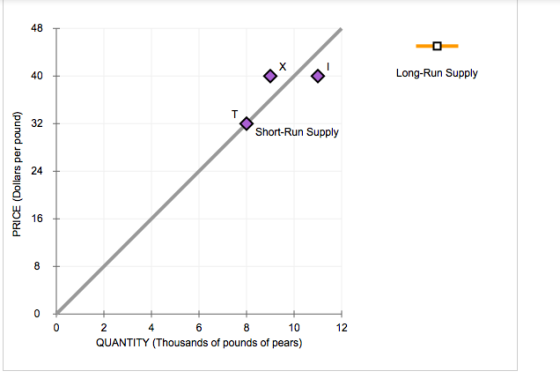
The following graph shows the short-run supply curve for pears.
Place the orange line (square symbol) on the graph to show the most likely long-run supply curve for pears. (Note: Place the points of the line either on T and I or on T and X.)
Homework Answers
Long-run supply being more elastic than short-run supply, the long-run supply curve will be flatter than the short-run supply curve. The relevant long-run supply curve will pass through points T and I.

Add Answer to:
10. Price elasticity of supply in the short run and long
run
The following graph shows...
4. Price elasticity of supply in the short run and long run The following graph shows...
 4. Price elasticity of supply in the short run and long run The following graph shows the long-run supply curve for persimmons. Place the orange line (square symbol) on the following graph to show the most likely short-run supply curve for persimmons. (Note: Place the points of the line either on R and U or on R and X.)
The following graph shows the short-run supply curve for pears. Place the orange line (square line...
 The following graph shows the short-run supply curve for pears. Place the orange line (square symbol) on the following graph to show the most likely long-run supply curve for pears. (Note: Place the points of the line either on I and F or on I and C.)
The following graph shows the short-run supply curve for pears. Place the orange line (square symbol)...
 The following graph shows the short-run supply curve for pears. Place the orange line (square symbol) on the following graph to show the most likely long-run supply curve for pears. (Note: Place the points of the line either on K and T or on K and C.)
Place the orange line (square symbol) on the following graph to show the most likely long-run Supply curve for persimmons.
 Place the orange line (square symbol) on the following graph to show the most likely long-run Supply curve for persimmons. (Note: Place the points of the line either on N and Moron N and L.)
6. Deriving the short-run supply curve Consider the competitive market for halogen lamps. The following graph...
 6. Deriving the short-run supply curve Consider the competitive market for halogen lamps. The following graph shows the marginal cost (MC), average total cost (ATC), and average variable cost (AVC) curves for a typical firm in the industry. COSTS (Dollars) AVC МСП OHH 0 10 90 100 20 30 40 50 60 70 80 QUANTITY (Thousands of lamps) On the following graph, use the orange points (square symbol) to plot points along the portion of the firm's short-run supply curve...
Deriving the short-run supply curve Consider the competitive market for halogen lamps. The following graph shows...
 Deriving the short-run supply curve
Consider the competitive market for halogen lamps. The following
graph shows the marginal cost (MC), average total cost (ATC), and
average variable cost (AVC) curves for a typical firm in the
industry.
For each price in the following table, use the graph to
determine the number of lamps this firm would produce in order to
maximize its profit. Assume that when the price is exactly equal to
the average variable cost, the firm is indifferent...
Deriving the short-run supply curve
Consider the competitive market for halogen lamps. The following
graph shows the marginal cost (MC), average total cost (ATC), and
average variable cost (AVC) curves for a typical firm in the
industry.
For each price in the following table, use the graph to
determine the number of lamps this firm would produce in order to
maximize its profit. Assume that when the price is exactly equal to
the average variable cost, the firm is indifferent...
17. Deriving the short-run supply curve Consider the competitive market for dress shirts. The following graph shows the marginal cost (MC)
 17. Deriving the short-run supply curve Consider the competitive market for dress shirts. The following graph shows the marginal cost (MC), average total cost (ATC), and average variable cost (AVC) curves for a typical firm in the industry. For each price in the following table, use the graph to determine the number of shirts this firm would produce in order to maximize its profit. Assume that when the price is exactly equal to the average variable cost, the firm is indifferent between...
6. Deriving the short-run supply curve Consider the competitive market for halogen lamps. The following graph...
 6. Deriving the short-run supply curve Consider the competitive market for halogen lamps. The following graph shows the marginal cost (MC), average total cost (ATC), and average variable cost (AVC) curves for a typical firm in the industry. For each price in the following table, use the graph to determine the number of lamps this firm would produce in order to maximize its profit. Assume that when the price is exactly equal to the average variable cost, the firm is indifferent between...
7. Short-run supply and long-run equilibrium Aa Aa Consider a perfectly competitive market for titanium. Assume...
 7. Short-run supply and long-run equilibrium Aa Aa Consider a perfectly competitive market for titanium. Assume that all firms in the industry are identical and have the marginal cost (MC), average total cost (ATC), and average variable cost (AVC) curves shown on the following graph. Assume also that it does not matter how many firms are in the industry. Tool Tip: Place the mouse cursor over orange square points on the MC curve to see coordinates. COSTS (Dollars per kilogram...
10. The long-run supply curve in different cost industries The following graph shows the market for...
 10. The long-run supply curve in different cost industries The following graph shows the market for milk. Initially, the market is in a long-run equilibrium. Suppose that a change in tastes resulted in a leftward shift in demand. On the following graph, shift the demand or supply curve to reflect this change in tastes. Then use the grey point (star symbol) to indicate the new short-run equilibrium. Note: Select and drag one or both of the curves to the desired position. Curves will snap...
 The following graph shows the short-run supply curve for pears. Place the orange line (square symbol) on the following graph to show the most likely long-run supply curve for pears. (Note: Place the points of the line either on I and F or on I and C.)
 6. Deriving the short-run supply curve Consider the competitive market for halogen lamps. The following graph shows the marginal cost (MC), average total cost (ATC), and average variable cost (AVC) curves for a typical firm in the industry. COSTS (Dollars) AVC МСП OHH 0 10 90 100 20 30 40 50 60 70 80 QUANTITY (Thousands of lamps) On the following graph, use the orange points (square symbol) to plot points along the portion of the firm's short-run supply curve...
 Deriving the short-run supply curve
Consider the competitive market for halogen lamps. The following
graph shows the marginal cost (MC), average total cost (ATC), and
average variable cost (AVC) curves for a typical firm in the
industry.
For each price in the following table, use the graph to
determine the number of lamps this firm would produce in order to
maximize its profit. Assume that when the price is exactly equal to
the average variable cost, the firm is indifferent...
Deriving the short-run supply curve
Consider the competitive market for halogen lamps. The following
graph shows the marginal cost (MC), average total cost (ATC), and
average variable cost (AVC) curves for a typical firm in the
industry.
For each price in the following table, use the graph to
determine the number of lamps this firm would produce in order to
maximize its profit. Assume that when the price is exactly equal to
the average variable cost, the firm is indifferent...
 7. Short-run supply and long-run equilibrium Aa Aa Consider a perfectly competitive market for titanium. Assume that all firms in the industry are identical and have the marginal cost (MC), average total cost (ATC), and average variable cost (AVC) curves shown on the following graph. Assume also that it does not matter how many firms are in the industry. Tool Tip: Place the mouse cursor over orange square points on the MC curve to see coordinates. COSTS (Dollars per kilogram...
Most questions answered within 3 hours.
-
Buckminsterfullerence is a recently allotrope of carbon in which
carbon atoms form molecules of formula C_60,...
asked 22 seconds from now -
Lower Equitorial and Upper Equitorial are the same except Lower
Equitorial has a larger capital stock....
asked 4 minutes ago -
how do you think that pH of a jar where you have added a certain
amount...
asked 14 minutes ago -
If the Federal Reserve increases the reserve requirement, what
will happen to the Money Supply in...
asked 9 minutes ago -
Suppose that market demand for a good is given by Q = 9 - 0.3 P...
asked 15 minutes ago -
two thin lenses are separated by a distance x. The first lens
has a focal length...
asked 17 minutes ago -
The computer that controls a bank's automatic teller machine
crashes a mean of 0.6 times per...
asked 20 minutes ago -
`1) How is -9 (base 10) represented in 8-bit two's complement
notation?
a) 00001001
b)11110111
c)11110110...
asked 30 minutes ago -
A 10.000 g sample of water contains 11.19% H by mass. what
should be the %H...
asked 48 minutes ago -
Consider an investment game among 2 players. Each player can
either invest,
i, or not invest,-i....
asked 45 minutes ago -
The time taken to complete a particular task is normally
distributed with a standard deviation of...
asked 55 minutes ago -
we have heteroskedasticity in a regression when:
When the variance of error terms changes when an...
asked 1 hour ago