
Homework Answers
Decrease in the value of home currency makes domestic goods cheaper and foreign goods expensive. This increases net exports that further leads to increase in aggregate demand.
Add Answer to:
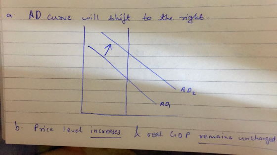
The figure to the right shows an economy in an initial long-run equilibrium at point A...
Text Problem 10-15 Question Help The figure to the right shows an economy in an initial...
 Text Problem 10-15 Question Help The figure to the right shows an economy in an initial long-run equilibrium at point A LRAS, a. Using the line drawing tool, show how, if at all the equilibrium real GDP and the long-run equilibrium price level are affected by a decrease in the value of the home currency in terms of the currencies of other nations. Property label this line. Carefully follow the instructions above, and only draw the required objects Price Level...
The figure to the right shows an economy in an initial long-run equilibrium at point LRAS,...
 The figure to the right shows an economy in an initial long-run equilibrium at point LRAS, aUsing the line drawing fool, show how, if at all the equilibrium real GDP and the long-run equilibrium price level are affected by a reduction in the quantity of money in circulation Properly label this line. Carefully follow the instructions above, and only draw the required objects b. According to your graph, the equilibrium price level real GDP while the equilibrium Price Level RGDP...
The graph to the right shows a situation in which the economy was in equilibrium at potential GDP (at point A) when the...
 The graph to the right shows a situation in which the economy was in equilibrium at potential GDP (at point A) when the demand for housing sharply declined. What actions can the federal government take to move the economy back to potential GDP? LRAS SRAS SRAS O A. Increase the money supply. B. Increase government spending or decrease taxes. O C. Decrease government spending or increase taxes. O D. Both A and B. Price level 1.) Use the line drawing...
supply curve to shift leftward to SRAS, as shown in the graph at right. The economy is currently in short-run equilibrium at point E, and the reduction in supply is expected to be permanent. LRAS...
 supply curve to shift leftward to SRAS, as shown in the graph at right. The economy is currently in short-run equilibrium at point E, and the reduction in supply is expected to be permanent. LRAS SRAS SRAS 1.) Using the line drawing and/or 3-point curved line drawing tool, show the adjustment to long-run equilibrium in this situation. Properly label your new curve(s). 2.) Using the point drawing tool, identify the new long-run equilibrium point and label the point 'E2 Carefully...
The economy of Ashenvale is currently in a short-run equilibrium, depicted by point "Eo" on the...
 The economy of Ashenvale is currently in a short-run equilibrium, depicted by point "Eo" on the graph The economy is currently experiencing a recessionary gap The size of this gap is $ If there is no intervention, the level of actual unemployment will Economy of Ashenvale 2,400 Y* 2,000 1,600 Vthe 1,300 natural level of unemployment As factor prices change, the unit cost of production will Firms will respond to these chagig ui costs by either of output or charging...
10 The following graph shows aggregate demand and short run aggregate supply 1.) Use the line...
 10 The following graph shows aggregate demand and short run aggregate supply 1.) Use the line drawing tool to show the effect of an unexpected decrease in the price of oil. Property label this line. 2.) Use the point drawing tool to show the new equilibrium price level and real GDP. Label this point 'B'. Caretaly follow the instructions above, and only draw the required objects. LRAS, SRA Prevel A "ADO Re GOPY
The diagram to the right shows equilibrium in the goods market defined by point A. 201...
 The diagram to the right shows equilibrium in the goods market defined by point A. 201 18- 16- 14 12- 1.) Using the line drawing tool, show the effects of a decline in current government purchases. Properly label this line. 2.) Using the point drawing tool, identify the new goods market equilibrium. Label this point 'EB' Carefully follow the instructions above, and only draw the required objects. 8- 4 2- Desired national saving & investment
The graph shows the economy in long-run equilibrium Then the world economy expands and the demand...
 The graph shows the economy in long-run equilibrium Then the world economy expands and the demand for U.S.-produced goods increases Price level (GDP deflator, 2009-100) 14 Draw a curve that shows 1) the effect of increased demand for U.S.-produced goods. Label it 1 2) the effect of a rising money wage rate that returns the economy to full employment. Label it 2. Draw a point at the new long-run equilibrium 13 SAS 12 An economy is in a long-run equilibrium....
от тот отрост Quiz OTPPUUIN The figure to the right shows the result of an increase...
 от тот отрост Quiz OTPPUUIN The figure to the right shows the result of an increase in aggregate demand from AD, to AD, . In its new short run equilibrium the economy is resting vits potential output. AS(Long run) AS. (Short run) Because the economy is producing beyond its potential output level, input prices and hence production costs are being pushed upward. Using either the line drawing tool or the 3-point curved line drawing tool, illustrate the impact of rising...
The graph on the right shows the market for hamburger, which is in equilibrium. Hamburger is...
 The graph on the right shows the market for hamburger, which is in equilibrium. Hamburger is a normal good, and people alike to eat cheese with hamburger. Beef is an input to hamburger production. Suppose that there is an increase in processing costs. 1.) Using the line drawing tool, show the effect on the market. Properly label your new curve. 2.) Using the point drawing tool, show the new equilibrium price and quantity Label your point E E25 Carefully follow...
 Text Problem 10-15 Question Help The figure to the right shows an economy in an initial long-run equilibrium at point A LRAS, a. Using the line drawing tool, show how, if at all the equilibrium real GDP and the long-run equilibrium price level are affected by a decrease in the value of the home currency in terms of the currencies of other nations. Property label this line. Carefully follow the instructions above, and only draw the required objects Price Level...
 The figure to the right shows an economy in an initial long-run equilibrium at point LRAS, aUsing the line drawing fool, show how, if at all the equilibrium real GDP and the long-run equilibrium price level are affected by a reduction in the quantity of money in circulation Properly label this line. Carefully follow the instructions above, and only draw the required objects b. According to your graph, the equilibrium price level real GDP while the equilibrium Price Level RGDP...
 The graph to the right shows a situation in which the economy was in equilibrium at potential GDP (at point A) when the demand for housing sharply declined. What actions can the federal government take to move the economy back to potential GDP? LRAS SRAS SRAS O A. Increase the money supply. B. Increase government spending or decrease taxes. O C. Decrease government spending or increase taxes. O D. Both A and B. Price level 1.) Use the line drawing...
 supply curve to shift leftward to SRAS, as shown in the graph at right. The economy is currently in short-run equilibrium at point E, and the reduction in supply is expected to be permanent. LRAS SRAS SRAS 1.) Using the line drawing and/or 3-point curved line drawing tool, show the adjustment to long-run equilibrium in this situation. Properly label your new curve(s). 2.) Using the point drawing tool, identify the new long-run equilibrium point and label the point 'E2 Carefully...
 The economy of Ashenvale is currently in a short-run equilibrium, depicted by point "Eo" on the graph The economy is currently experiencing a recessionary gap The size of this gap is $ If there is no intervention, the level of actual unemployment will Economy of Ashenvale 2,400 Y* 2,000 1,600 Vthe 1,300 natural level of unemployment As factor prices change, the unit cost of production will Firms will respond to these chagig ui costs by either of output or charging...
 10 The following graph shows aggregate demand and short run aggregate supply 1.) Use the line drawing tool to show the effect of an unexpected decrease in the price of oil. Property label this line. 2.) Use the point drawing tool to show the new equilibrium price level and real GDP. Label this point 'B'. Caretaly follow the instructions above, and only draw the required objects. LRAS, SRA Prevel A "ADO Re GOPY
 The diagram to the right shows equilibrium in the goods market defined by point A. 201 18- 16- 14 12- 1.) Using the line drawing tool, show the effects of a decline in current government purchases. Properly label this line. 2.) Using the point drawing tool, identify the new goods market equilibrium. Label this point 'EB' Carefully follow the instructions above, and only draw the required objects. 8- 4 2- Desired national saving & investment
 The graph shows the economy in long-run equilibrium Then the world economy expands and the demand for U.S.-produced goods increases Price level (GDP deflator, 2009-100) 14 Draw a curve that shows 1) the effect of increased demand for U.S.-produced goods. Label it 1 2) the effect of a rising money wage rate that returns the economy to full employment. Label it 2. Draw a point at the new long-run equilibrium 13 SAS 12 An economy is in a long-run equilibrium....
 от тот отрост Quiz OTPPUUIN The figure to the right shows the result of an increase in aggregate demand from AD, to AD, . In its new short run equilibrium the economy is resting vits potential output. AS(Long run) AS. (Short run) Because the economy is producing beyond its potential output level, input prices and hence production costs are being pushed upward. Using either the line drawing tool or the 3-point curved line drawing tool, illustrate the impact of rising...
 The graph on the right shows the market for hamburger, which is in equilibrium. Hamburger is a normal good, and people alike to eat cheese with hamburger. Beef is an input to hamburger production. Suppose that there is an increase in processing costs. 1.) Using the line drawing tool, show the effect on the market. Properly label your new curve. 2.) Using the point drawing tool, show the new equilibrium price and quantity Label your point E E25 Carefully follow...
Most questions answered within 3 hours.
-
Calculate the expected value, the variance, and the standard
deviation of the given random variable X....
asked 41 minutes ago -
A hospital performs 100 surgeries per week. The probability that
complications after surgery occur is 10%....
asked 57 minutes ago -
1 point) Given the significance level α=0.01 find the following:
(a) left-tailed z value z= (b)...
asked 39 minutes ago -
Assuming you are the head of the software development unit at
Cyber.Soft, explain and justify why...
asked 5 minutes ago -
Magnesium and nitrogen react in a combination reaction to
produce magnesium nitride. 3 Mg + N2...
asked 13 minutes ago -
Two electrons are initially at rest separated by a distance of
2nm. At time t=0, they...
asked 11 minutes ago -
A martial artist is practicing breaking 5 boards. He is able to
break aboard with probability...
asked 19 minutes ago -
The rate constant of a first-order reaction is 2.95 × 10⁻⁴ s−1
at 350.° C. If...
asked 22 minutes ago -
implement a class called PiggyBank that will be used to
represent a collection of coins. Functionality...
asked 13 minutes ago -
2. Use the following information in the table to answer the
following questions. (Numbers are in...
asked 19 minutes ago -
The fuel economy of a 2011 Lexus RX 350 2wd 6 cylinder 3.5 L
automatic 5...
asked 27 minutes ago -
i.
the synthesized compund 2-bromo-butanal i have a IR peak at about
3200 and one at...
asked 27 minutes ago