


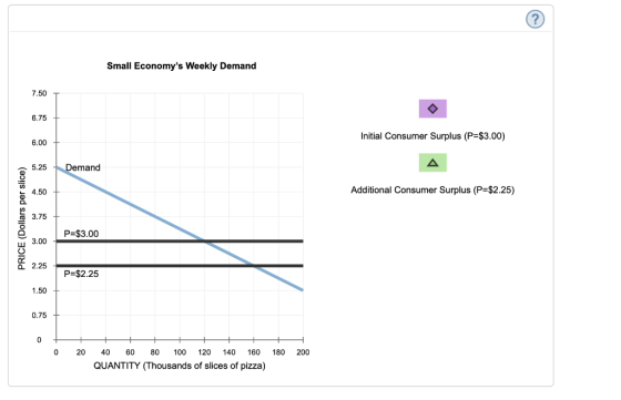
Becky's Weekly Demand 7.50 6.75 6.00 Demand 5.25 4,50 3.75 Price 3.00 2,25 1.50 0.75 0 0 10 12 14 16 18 20 4 QUANTITY (Slices of pizza) From the previous graph, you can tell that Becky is willing to pay $ for her 8th slice of pizza each week. Since she has to pay only $3.00 per slice, the consumer surplus she gains from the 8th slice of pizza is $ PRICE (Dollars per slice)
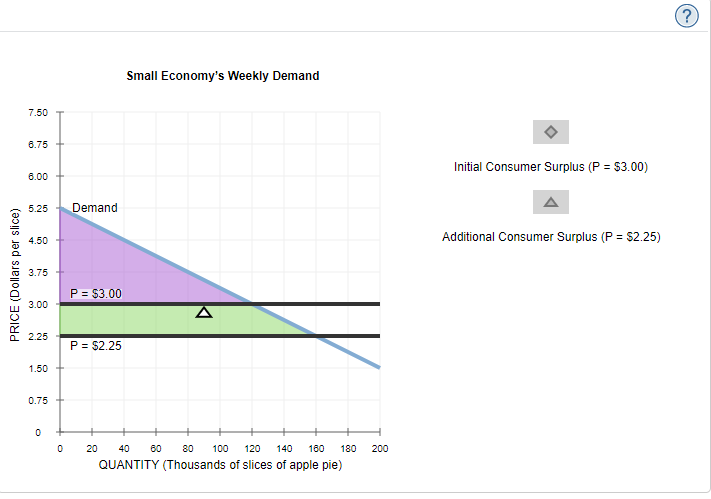
Suppose the price of pizza were to fall to $2.25 per slice. At this lower price, Becky would receive a consumer surplus of $ from the 8th slice of pizza she buys. The following graph shows the weekly market demand for pizza in a small economy. Use the purple point (diamond symbol) to shade the area representing consumer surplus when the price (P) of pizza is $3.00 per slice. Then, use the green point (triangle symbol) to shade the area representing additional consumer surplus when the price falls to $2.25 per slice.
Small Economy's Weekly Demand 7.50 6.75 Initial Consumer Surplus (P-$3.00) 6.00 A Demand 5.25 Additional Consumer Surplus (P=$2.25) 4.50 3.75 P-$3.00 3.00 2.25 P-$2.25 1.50 0.75 0 0 20 40 60 80 100 120 140 160 180 200 QUANTITY (Thousands of slices of pizza) PRICE (Dollars per slice)
Homework Answers
Add Answer to:
7. Consumer surplus for an individual and a market The following graph shows Becky's weekly demand...
Consumer surplus for an individual and a market The following graph shows Cho's weekly demand for...
 Consumer surplus for an individual and a
market
The following graph shows Cho's weekly demand for cheesecake,
represented by the blue line. Point A represents a point along her
weekly demand curve. The market price of cheesecake is $3.00 per
slice, as shown by the horizontal black line.
Cho's Weekly Demand 7.50 6.75 6.00 5.25 4.50 3.75 Price 3.00 2.25 1.50 0.75 0 28 10 12 41 18 20 QUANTITY (Slices of cheesecake) From the previous graph, you can tell...
Consumer surplus for an individual and a
market
The following graph shows Cho's weekly demand for cheesecake,
represented by the blue line. Point A represents a point along her
weekly demand curve. The market price of cheesecake is $3.00 per
slice, as shown by the horizontal black line.
Cho's Weekly Demand 7.50 6.75 6.00 5.25 4.50 3.75 Price 3.00 2.25 1.50 0.75 0 28 10 12 41 18 20 QUANTITY (Slices of cheesecake) From the previous graph, you can tell...
could you help me this whole question? 2. Consumer surplus for an individual and a market...
 could you help me this whole
question?
2. Consumer surplus for an individual and a market The following graph shows Yvette's weekly demand for pizza, represented by the blue line. Point A represents a point along her weekly demand curve. The market price of pizza is $3.00 per slice, as shown by the horizontal black line. Yvette's Weekly Demand 7.50 T 6.75 .25Demand tx 3.75 Price e 3.00 2 으2.25 0.75 0 246 8 14 16 18 20 QUANTITY (Slices...
could you help me this whole
question?
2. Consumer surplus for an individual and a market The following graph shows Yvette's weekly demand for pizza, represented by the blue line. Point A represents a point along her weekly demand curve. The market price of pizza is $3.00 per slice, as shown by the horizontal black line. Yvette's Weekly Demand 7.50 T 6.75 .25Demand tx 3.75 Price e 3.00 2 으2.25 0.75 0 246 8 14 16 18 20 QUANTITY (Slices...
2. Consumer surplus for an individual and a market The following graph shows Jacques's weekly demand...
 2. Consumer surplus for an individual and a market The following graph shows Jacques's weekly demand for cheesecake, represented by the blue line. Point A represents a point along his weekly demand curve. The market price of cheesecake is $1.25 per slice, as shown by the horizontal black line. Jacques's Weekly Demand 2.50 Demand 2.25 2.00 1 75 1.50 Price 1 25 1,00 0.75 0.50 0 25 0 2468 101214 16 18 20 QUANTITY (Slices of cheesecake) for his 8th...
Producer surplus for an individual and a market. Suppose the market for pizza is a perfectly...
 Producer surplus for an individual and a
market.
Suppose the market for pizza is a perfectly competitive
market—that is, sellers take the market price as given. Sean owns a
restaurant where he sells pizza. The following graph shows Sean's
weekly supply curve, represented by the orange line. Point A
represents a point along his supply curve. The price of pizza is
$3.00 per slice, as shown by the horizontal black line.
From the previous graph, you can tell that Sean...
Producer surplus for an individual and a
market.
Suppose the market for pizza is a perfectly competitive
market—that is, sellers take the market price as given. Sean owns a
restaurant where he sells pizza. The following graph shows Sean's
weekly supply curve, represented by the orange line. Point A
represents a point along his supply curve. The price of pizza is
$3.00 per slice, as shown by the horizontal black line.
From the previous graph, you can tell that Sean...
4. Consumer surplus for an individual and a market The following graph shows Sam's weekly demand...
 4. Consumer surplus for an individual and a market The following graph shows Sam's weekly demand for apple pie, represented by the blue line. Point A represents a point along his weekly demand curve. The market price of apple pie is $3.00 per slice, as shown by the horizontal black line. Sam's Weekly Demand 7.50 6.75 6.00 3.75 Price 3.00 a 2.25 1.50 0.75 2 4 0 2 14 18 20 QUANTITY (Slices of apple pie)
Homework (Ch 07) 7. Producer surplus for an individual and a market . Suppose the market...
 Homework (Ch 07) 7. Producer surplus for an individual and a market . Suppose the market for plzza is a perfectly competitive market-that is, sellers take the market price as given. Van owns a restaurant w pizza. The following graph shows Van's weekly supply curve, represented by the orange line. Point A represents of pizza is $3.00 per slice, as shown by the horizontal black line. PRICE (Dollars per slice) R & + From the previous graph, you can tell...
The following graph shows Eleanor's weekly demand for apple pie, represented by the blue line. Point...
 The following graph shows Eleanor's weekly demand for apple pie, represented by the blue line. Point A represents a point along her weekly demand curve. The market price of apple pie is $3.00 per slice, as shown by the horizontal black line. From the previews graph, you can tell that Eleanor is willing to pay for her 8th slice of apple pie each week. Because she has to pay only $3.00 per slice, the consumer surplus she gains from the...
could you help me finish this whole question? 4. Producer surplus for an individual and a...
 could you help me finish this
whole question?
4. Producer surplus for an individual and a market Suppose the market for cheesecake is a perfectly competitive market-that is, sellers take the market price as given. Bob owns a restaurant where he sells cheesecake. The following graph shows Bob's weekly supply curve, represented by the orange line. Point A represents a point along his supply curve. The price of cheesecake is $3.00 per slice, as shown by the horizontal black line...
could you help me finish this
whole question?
4. Producer surplus for an individual and a market Suppose the market for cheesecake is a perfectly competitive market-that is, sellers take the market price as given. Bob owns a restaurant where he sells cheesecake. The following graph shows Bob's weekly supply curve, represented by the orange line. Point A represents a point along his supply curve. The price of cheesecake is $3.00 per slice, as shown by the horizontal black line...
Suppose the market for pizza is a perfectly competitive market-that is, sellers take the market price...
 Suppose the market for pizza is a perfectly competitive market-that is, sellers take the market price as given. Rosa owns a restaurant where she sells pizza. The following graph shows Rosa's weekly supply curve, represented by the orange line. Point A represents a point along her supply curve. The price of pizza is $3.00 per slice, as shown by the horizontal black line. From the previous graph, you can tell that Rosa is willing to supply her sth slice of pizza...
1. Consumer surplus for an individual and a market The following graph shows Rosa's weekly demand...
 1. Consumer surplus for an individual and a market The following graph shows Rosa's weekly demand for apple pie, represented by the blue line. Point A represents a point along her weekly demand curve. The market price of apple pie is $3.00 per slice, as shown by the horizontal black line.
 Consumer surplus for an individual and a
market
The following graph shows Cho's weekly demand for cheesecake,
represented by the blue line. Point A represents a point along her
weekly demand curve. The market price of cheesecake is $3.00 per
slice, as shown by the horizontal black line.
Cho's Weekly Demand 7.50 6.75 6.00 5.25 4.50 3.75 Price 3.00 2.25 1.50 0.75 0 28 10 12 41 18 20 QUANTITY (Slices of cheesecake) From the previous graph, you can tell...
Consumer surplus for an individual and a
market
The following graph shows Cho's weekly demand for cheesecake,
represented by the blue line. Point A represents a point along her
weekly demand curve. The market price of cheesecake is $3.00 per
slice, as shown by the horizontal black line.
Cho's Weekly Demand 7.50 6.75 6.00 5.25 4.50 3.75 Price 3.00 2.25 1.50 0.75 0 28 10 12 41 18 20 QUANTITY (Slices of cheesecake) From the previous graph, you can tell...
 could you help me this whole
question?
2. Consumer surplus for an individual and a market The following graph shows Yvette's weekly demand for pizza, represented by the blue line. Point A represents a point along her weekly demand curve. The market price of pizza is $3.00 per slice, as shown by the horizontal black line. Yvette's Weekly Demand 7.50 T 6.75 .25Demand tx 3.75 Price e 3.00 2 으2.25 0.75 0 246 8 14 16 18 20 QUANTITY (Slices...
could you help me this whole
question?
2. Consumer surplus for an individual and a market The following graph shows Yvette's weekly demand for pizza, represented by the blue line. Point A represents a point along her weekly demand curve. The market price of pizza is $3.00 per slice, as shown by the horizontal black line. Yvette's Weekly Demand 7.50 T 6.75 .25Demand tx 3.75 Price e 3.00 2 으2.25 0.75 0 246 8 14 16 18 20 QUANTITY (Slices...
 2. Consumer surplus for an individual and a market The following graph shows Jacques's weekly demand for cheesecake, represented by the blue line. Point A represents a point along his weekly demand curve. The market price of cheesecake is $1.25 per slice, as shown by the horizontal black line. Jacques's Weekly Demand 2.50 Demand 2.25 2.00 1 75 1.50 Price 1 25 1,00 0.75 0.50 0 25 0 2468 101214 16 18 20 QUANTITY (Slices of cheesecake) for his 8th...
 Producer surplus for an individual and a
market.
Suppose the market for pizza is a perfectly competitive
market—that is, sellers take the market price as given. Sean owns a
restaurant where he sells pizza. The following graph shows Sean's
weekly supply curve, represented by the orange line. Point A
represents a point along his supply curve. The price of pizza is
$3.00 per slice, as shown by the horizontal black line.
From the previous graph, you can tell that Sean...
Producer surplus for an individual and a
market.
Suppose the market for pizza is a perfectly competitive
market—that is, sellers take the market price as given. Sean owns a
restaurant where he sells pizza. The following graph shows Sean's
weekly supply curve, represented by the orange line. Point A
represents a point along his supply curve. The price of pizza is
$3.00 per slice, as shown by the horizontal black line.
From the previous graph, you can tell that Sean...
 4. Consumer surplus for an individual and a market The following graph shows Sam's weekly demand for apple pie, represented by the blue line. Point A represents a point along his weekly demand curve. The market price of apple pie is $3.00 per slice, as shown by the horizontal black line. Sam's Weekly Demand 7.50 6.75 6.00 3.75 Price 3.00 a 2.25 1.50 0.75 2 4 0 2 14 18 20 QUANTITY (Slices of apple pie)
 Homework (Ch 07) 7. Producer surplus for an individual and a market . Suppose the market for plzza is a perfectly competitive market-that is, sellers take the market price as given. Van owns a restaurant w pizza. The following graph shows Van's weekly supply curve, represented by the orange line. Point A represents of pizza is $3.00 per slice, as shown by the horizontal black line. PRICE (Dollars per slice) R & + From the previous graph, you can tell...
 The following graph shows Eleanor's weekly demand for apple pie, represented by the blue line. Point A represents a point along her weekly demand curve. The market price of apple pie is $3.00 per slice, as shown by the horizontal black line. From the previews graph, you can tell that Eleanor is willing to pay for her 8th slice of apple pie each week. Because she has to pay only $3.00 per slice, the consumer surplus she gains from the...
 could you help me finish this
whole question?
4. Producer surplus for an individual and a market Suppose the market for cheesecake is a perfectly competitive market-that is, sellers take the market price as given. Bob owns a restaurant where he sells cheesecake. The following graph shows Bob's weekly supply curve, represented by the orange line. Point A represents a point along his supply curve. The price of cheesecake is $3.00 per slice, as shown by the horizontal black line...
could you help me finish this
whole question?
4. Producer surplus for an individual and a market Suppose the market for cheesecake is a perfectly competitive market-that is, sellers take the market price as given. Bob owns a restaurant where he sells cheesecake. The following graph shows Bob's weekly supply curve, represented by the orange line. Point A represents a point along his supply curve. The price of cheesecake is $3.00 per slice, as shown by the horizontal black line...
 Suppose the market for pizza is a perfectly competitive market-that is, sellers take the market price as given. Rosa owns a restaurant where she sells pizza. The following graph shows Rosa's weekly supply curve, represented by the orange line. Point A represents a point along her supply curve. The price of pizza is $3.00 per slice, as shown by the horizontal black line. From the previous graph, you can tell that Rosa is willing to supply her sth slice of pizza...
 1. Consumer surplus for an individual and a market The following graph shows Rosa's weekly demand for apple pie, represented by the blue line. Point A represents a point along her weekly demand curve. The market price of apple pie is $3.00 per slice, as shown by the horizontal black line.
Most questions answered within 3 hours.
-
Why would natural selection not minimize costs (in the form of
symptoms) of evolved defenses? (choose...
asked 17 minutes ago -
What is true about a critical task?
Latest finish time - latest start time = 0...
asked 19 minutes ago -
A company uses a
process costing system. Its Assembly Department's beginning
inventory consisted of 56,800 units,...
asked 19 minutes ago -
a
sealed glass cylinder contains 325 g of N2 gas at 1.02 atm at 20 c....
asked 23 minutes ago -
The main difference between an equity and a nonequity alliance
is that
A
equity alliances are...
asked 22 minutes ago -
Need help with this, in JAVA, using netbeans. A
complete response will receive a positive comment...
asked 30 minutes ago -
An imprest petty cash fund of $600 was established for minor
disbursements. At the end of...
asked 35 minutes ago -
Sharpe Cutter is a small company that produces specialty knives
for paper cutting machinery. The annual...
asked 40 minutes ago -
Calculating the Ka of a weak acid from
pH:
The pH of a 0.68M solution of...
asked 41 minutes ago -
1.What process is pushing back against gravity in the very
center (the core) of sun-like stars?...
asked 1 hour ago -
This question is from the textbook "Python for ArcGIS" by Laura
Tateosian:
Write a script "triangles.py"...
asked 59 minutes ago -
Which of the following is an impediment that makes it
difficult for firms to achieve the...
asked 1 hour ago