


Homework Answers
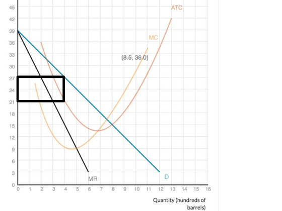
(a) When Quantity = 400, Price (From demand curve) = $27 and ATC = $21
Profit = Q x (P - ATC) = 400 x $(27 - 21) = 400 x $6 = $2400
(b) Maximum profit means MR intersects MC here Q = 500 and Price = $24
(c) In following graph the black rectangle represents profit.
Add Answer to:
The graph below shows the demand (D), marginal revenue (MR), marginal cost (MC), and average total...
The graph below shows the demand (D), marginal revenue (MR), marginal cost (MC), and average total cost (ATC) curves for a supplier of bottled water to commercial buildings. The firm operates as a local monopoly. Use the area tool to draw the rectangle th
 The graph below shows the demand (D), marginal revenue (MR), marginal cost (MC), and average total cost (ATC) curves for a supplier of bottled water to commercial buildings. The firm operates as a local monopoly. Use the area tool to draw the rectangle that represents the firm's profit if the market quantity is 7,000 bottles.Your answer should be a rectangle with four corners. To refer to the graphing tutorial for this question type, please click here.
The graph below shows a monopolist's demand (D), marginal revenue (MR), marginal cost (MC), and average...
 The graph below shows a monopolist's demand (D), marginal
revenue (MR), marginal cost (MC), and average total cost (ATC)
curves. Management wants to adjust the production output quantity
to maximize the firm's profits. What quantity should the firm aim
for?
Give your answer by dragging the Q line to a new position to mark
the quantity at which profit is as large as possible.
Price and cost ATC MC MR Quantity
The graph below shows a monopolist's demand (D), marginal
revenue (MR), marginal cost (MC), and average total cost (ATC)
curves. Management wants to adjust the production output quantity
to maximize the firm's profits. What quantity should the firm aim
for?
Give your answer by dragging the Q line to a new position to mark
the quantity at which profit is as large as possible.
Price and cost ATC MC MR Quantity
The graph shows the demand (D), marginal revenue (MR), and marginal cost (MC) curves for a...
 The graph shows the demand (D), marginal revenue (MR),
and marginal cost (MC) curves for a monopolist. Use the area tool
to outline the region corresponding to the deadweight loss that is
due to the market being monopolistic rather than competitive. Your
answer should be a triangle drawn with three corners.
Thank you.
The graph shows the demand (D), marginal revenue (MR), and marginal cost (MC curves for a monopolist. Use the area tool to outline the region corresponding to...
The graph shows the demand (D), marginal revenue (MR),
and marginal cost (MC) curves for a monopolist. Use the area tool
to outline the region corresponding to the deadweight loss that is
due to the market being monopolistic rather than competitive. Your
answer should be a triangle drawn with three corners.
Thank you.
The graph shows the demand (D), marginal revenue (MR), and marginal cost (MC curves for a monopolist. Use the area tool to outline the region corresponding to...
The curves show the marginal revenue (MR), marginal cost (MC), and average total cost (ATC) functions...
 The curves show the marginal revenue (MR), marginal cost (MC), and average total cost (ATC) functions for a firm in a competitive market. Use the area tool to draw the area representing the maximum profit the firm could earn—that is, the profit the firm would earn if it produced the optimal quantity. Your answer should be a rectangle drawn with four corners.
The following graph shows the marginal cost (MC), marginal revenue (MR), average total cost (ATC), and...
 The following graph shows the marginal cost (MC), marginal revenue (MR), average total cost (ATC), and demand (D) for a monopolist. Suppose that this monopolist cannot price discriminate. Place the grey point (starymbol) on the graph to indicate the profit-maximizing price and quantity for this monopolist. If the monopolist is making a profitne the green rectangle (triungle symbols) to shade in the area representing its profit. On the other hand, if the monopolist is suffering a loss use the purple...
The graph on the right shows the demand, marginal revenue, marginal cost, and average total cost...
 The graph on the right shows the demand, marginal revenue, marginal cost, and average total cost curves for a monopolist. Show the impact if this firm was regulated to charge the fair-returns price? On graph 2: 1.) Using the point drawing tool, place a point at the output and price combination that would result from regulation if the monopoly was required to charge the fair-returns price. 2.) Using the triangle drawing tool, indicate the deadweight loss that would result from...
The graph below shows a monopolist's demand (D), marginal revenue (MR), marginal cost (MC), and average total cost (ATC) curves. Management wants to adjust the production output quantity to maximize the firm's profits. What quantity should the firm aim fo
 The graph below shows a monopolist's demand (D), marginal revenue (MR), marginal cost (MC), and average total cost (ATC) curves. Management wants to adjust the production output quantity to maximize the firm's profits. What quantity should the firm aim for?Give your answer by dragging the Q line to a new position to mark the quantity at which profit is as large as possible. To refer to the graphing tutorial for this question type, please click here.
The graph shows a monopolist's demand (D), marginal revenue (MR), marginal cost (MC), and average total...
 The graph shows a monopolist's demand (D), marginal revenue (MR), marginal cost (MC), and average total cost (ATC) curves. Despite having the market all to itself, the firm has struggled to make money. Suppose that the firm is sold,and the new owner is initially less intent on maximizing profits than on simply making a profit. What range of production quantities will low the frm to operate while earning a profit? Give your answer by those limits dragging the Qmin to...
The curves show the marginal cost (MC), average variable cost (AVC) and average total cost (ATC)...
 The curves show the marginal cost (MC), average variable cost (AVC) and average total cost (ATC) curves for a firm that sell mid-range cars in a competitive market. Use the area tool to draw the area representing the firms profit or loss, if the firm produce 6000 cars. Your answer should be a rectangle drawn with four corners
When the firm produce 6000 cars it earn a profit or suffer a loss of ----- million
The curves show the marginal cost (MC), average variable cost (AVC) and average total cost (ATC) curves for a firm that sell mid-range cars in a competitive market. Use the area tool to draw the area representing the firms profit or loss, if the firm produce 6000 cars. Your answer should be a rectangle drawn with four corners
When the firm produce 6000 cars it earn a profit or suffer a loss of ----- million
The graph shows the demand (D), marginal cost (MC), marginal revenue (MR), and average variable cost (AVC) curves for a firm that is a price maker for its product.
 The graph shows the demand (D), marginal cost (MC), marginal revenue (MR), and average variable cost (AVC) curves for a firm that is a price maker for its product. The MC and AVC curves slope upward because one of the materials used to make the product is scarce. The firm can obtain a small supply cheaply, but additional units get more and more expensive. Additionally, the firm faces no fixed costs. If the firm is able to practice price discrimination, using...
 The graph below shows a monopolist's demand (D), marginal
revenue (MR), marginal cost (MC), and average total cost (ATC)
curves. Management wants to adjust the production output quantity
to maximize the firm's profits. What quantity should the firm aim
for?
Give your answer by dragging the Q line to a new position to mark
the quantity at which profit is as large as possible.
Price and cost ATC MC MR Quantity
The graph below shows a monopolist's demand (D), marginal
revenue (MR), marginal cost (MC), and average total cost (ATC)
curves. Management wants to adjust the production output quantity
to maximize the firm's profits. What quantity should the firm aim
for?
Give your answer by dragging the Q line to a new position to mark
the quantity at which profit is as large as possible.
Price and cost ATC MC MR Quantity
 The graph shows the demand (D), marginal revenue (MR),
and marginal cost (MC) curves for a monopolist. Use the area tool
to outline the region corresponding to the deadweight loss that is
due to the market being monopolistic rather than competitive. Your
answer should be a triangle drawn with three corners.
Thank you.
The graph shows the demand (D), marginal revenue (MR), and marginal cost (MC curves for a monopolist. Use the area tool to outline the region corresponding to...
The graph shows the demand (D), marginal revenue (MR),
and marginal cost (MC) curves for a monopolist. Use the area tool
to outline the region corresponding to the deadweight loss that is
due to the market being monopolistic rather than competitive. Your
answer should be a triangle drawn with three corners.
Thank you.
The graph shows the demand (D), marginal revenue (MR), and marginal cost (MC curves for a monopolist. Use the area tool to outline the region corresponding to...
 The curves show the marginal revenue (MR), marginal cost (MC), and average total cost (ATC) functions for a firm in a competitive market. Use the area tool to draw the area representing the maximum profit the firm could earn—that is, the profit the firm would earn if it produced the optimal quantity. Your answer should be a rectangle drawn with four corners.
 The following graph shows the marginal cost (MC), marginal revenue (MR), average total cost (ATC), and demand (D) for a monopolist. Suppose that this monopolist cannot price discriminate. Place the grey point (starymbol) on the graph to indicate the profit-maximizing price and quantity for this monopolist. If the monopolist is making a profitne the green rectangle (triungle symbols) to shade in the area representing its profit. On the other hand, if the monopolist is suffering a loss use the purple...
 The graph on the right shows the demand, marginal revenue, marginal cost, and average total cost curves for a monopolist. Show the impact if this firm was regulated to charge the fair-returns price? On graph 2: 1.) Using the point drawing tool, place a point at the output and price combination that would result from regulation if the monopoly was required to charge the fair-returns price. 2.) Using the triangle drawing tool, indicate the deadweight loss that would result from...
 The graph shows a monopolist's demand (D), marginal revenue (MR), marginal cost (MC), and average total cost (ATC) curves. Despite having the market all to itself, the firm has struggled to make money. Suppose that the firm is sold,and the new owner is initially less intent on maximizing profits than on simply making a profit. What range of production quantities will low the frm to operate while earning a profit? Give your answer by those limits dragging the Qmin to...
 The curves show the marginal cost (MC), average variable cost (AVC) and average total cost (ATC) curves for a firm that sell mid-range cars in a competitive market. Use the area tool to draw the area representing the firms profit or loss, if the firm produce 6000 cars. Your answer should be a rectangle drawn with four corners
When the firm produce 6000 cars it earn a profit or suffer a loss of ----- million
The curves show the marginal cost (MC), average variable cost (AVC) and average total cost (ATC) curves for a firm that sell mid-range cars in a competitive market. Use the area tool to draw the area representing the firms profit or loss, if the firm produce 6000 cars. Your answer should be a rectangle drawn with four corners
When the firm produce 6000 cars it earn a profit or suffer a loss of ----- million
Most questions answered within 3 hours.
-
A diamond's index of refraction for red light, 656 nm, is 2.410,
while that for blue...
asked 1 minute ago -
Compare HPLC, SPE, and GC. Identify the differences, the
advantages, and the weaknesses of each method.
asked 3 minutes ago -
Characteristic x-rays emitted by potassium have a wavelength of
0.374 nm. What is the energy of...
asked 5 minutes ago -
there is a function to create two random numbers between 1 and
25 and a function...
asked 23 minutes ago -
At a certain temperature, the ?pKp for the decomposition of
H2SH2S is 0.832.0.832.
H2S(g)↽−−⇀H2(g)+S(g)H2S(g)↽−−⇀H2(g)+S(g)
Initially, only...
asked 17 minutes ago -
Part 1.C&A Fast Food has four activities in serving a
customer: greet customer, take order, process...
asked 23 minutes ago -
Which attribute allows you to specify a custom "thumbnail" for
multimedia elements?
asked 1 hour ago -
How much 0.1200 M sodium hydroxide solution is need to titrate
14 mL of a 0.100...
asked 37 minutes ago -
An impulse is a change in momentum usually over
a short time. For which of the...
asked 42 minutes ago -
1a)When a 5000-kg roller coaster train full of riders approaches
the loading dock at a speed...
asked 1 hour ago -
The Poseidon Swim Company produces swim trunks. The average
selling price for one of their swim...
asked 57 minutes ago -
If the elasticity of supply of a good is ∞, then its
A. supply curve is...
asked 44 minutes ago