5) What options do we have to trade to produce the following
payoff graph?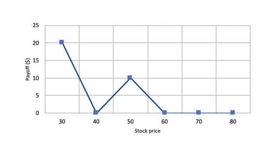
Homework Answers
Sell two call option at EP = 30
Buy three call option at EP = 40
Sell two call option at EP = 50
Buy one call option at EP = 60
Add Answer to:
5) What options do we have to trade to produce the following
payoff graph?
25 20...
Options available: a. b. c. d. We were unable to transcribe this imageOn the following graph,...
 Options available:
a.
b.
c.
d.
We were unable to transcribe this imageOn the following graph, use the green point (triangle symbol) to plot the annual total revenue when the market price is $20, $30, $40, $50, $60, $70 and $80 per bike 1300 1200 Total Revenue 1100 1000 Ш 900 800 700 600 500 0 10 20 30 40 50 60 70 80 90 100 110 120 PRICE (Dollars per bike) According to the midpoint method, the price elasticity...
Options available:
a.
b.
c.
d.
We were unable to transcribe this imageOn the following graph, use the green point (triangle symbol) to plot the annual total revenue when the market price is $20, $30, $40, $50, $60, $70 and $80 per bike 1300 1200 Total Revenue 1100 1000 Ш 900 800 700 600 500 0 10 20 30 40 50 60 70 80 90 100 110 120 PRICE (Dollars per bike) According to the midpoint method, the price elasticity...
Consider the perfectly competitive market for halogen ceiling lamps. The following graph shows the marginal cost...
 Consider the perfectly competitive market for halogen ceiling lamps. The following graph shows the marginal cost (MC), average total cost (ATC), and average variable cost (AVC) curves for a typical firm in the industry. COSTS (Dollars per tamp) 100 MC 90 80 70 60 50 ATC AVC 40 30 20 10 0 5 10 15 20 25 30 35 40 45 50 QUANTITY OF OUTPUT (Thousands of lamps) For each price in the following table, use the graph to determine...
You own a call option on Intuit stock with a strike price of $37. When you...
 You own a call option on Intuit stock with a strike price of $37. When you purchased the option, it cost $5. The option will expire in exactly three months' time. a. If the stock is trading at $50 in three months, what will be the payoff of the call? What will be the profit of the call? b. If the stock is trading at $22 in three months, what will be the payoff of the call? What will be...
3. The following graph shows the cost and revenue curves for a firm in a perfectly...
 3. The following graph shows the cost and revenue curves for a firm in a perfectly competitive market. 90 80 D=MR 70 60 ATC Price and cost ($) 50 AVC 40 30 MC 20 10 0 10 20 30 40 50 60 70 80 90 a) Assume that new firms enter this market and that drives the price down to $35 per unit. Will the firm continue to produce or shut down? Explain your answer.
show work. 1) Graph the histogram for the following frequency table. Calculate the relative and Cumulative...
 show work.
1) Graph the histogram for the following frequency table. Calculate the relative and Cumulative Frequencies. Graph the Cumulative Frequency Histograms. Classes Frequency 10-20 4 20-30 7 30-40 15 40-50 17 50-60 8 60-70 3 2) Graph the histogram for the following frequency table. Graph the Frequency Polygon, and the Ogive. Label all points on the graphs. Classes Frequency 0-20 20-40 5 40-60 10 60-80 29 80-100 12 5
show work.
1) Graph the histogram for the following frequency table. Calculate the relative and Cumulative Frequencies. Graph the Cumulative Frequency Histograms. Classes Frequency 10-20 4 20-30 7 30-40 15 40-50 17 50-60 8 60-70 3 2) Graph the histogram for the following frequency table. Graph the Frequency Polygon, and the Ogive. Label all points on the graphs. Classes Frequency 0-20 20-40 5 40-60 10 60-80 29 80-100 12 5
first & third drop down options: Graph 1 / Graph 2 second and fourth drop down...
 first & third drop down options: Graph 1 / Graph 2
second and fourth drop down options: buyers / sellers
Consider the market for rubber bands. The following graphs give two different examples of possible demand and supply curves in this market. Use the graphs to help you answer the following questions. You will not be graded on any changes you make to these graphs. Graph 1 Demand Tax Wedge Supply Area Price of Rubber Bands 0 90 100 10...
first & third drop down options: Graph 1 / Graph 2
second and fourth drop down options: buyers / sellers
Consider the market for rubber bands. The following graphs give two different examples of possible demand and supply curves in this market. Use the graphs to help you answer the following questions. You will not be graded on any changes you make to these graphs. Graph 1 Demand Tax Wedge Supply Area Price of Rubber Bands 0 90 100 10...
Use the graph below to answer questions 6 through 10. Price (S) 20 Supply 7.5 0...
 Use the graph below to answer questions 6 through 10.
Price (S) 20 Supply 7.5 0 10 20 30 40 50 60 70 Quantity 6. When this market is in equilibrium, consumer surplus is equal to and producer surplus is equal to a. $200: $100 $100; $200 c. $400; $200 d. $200; $400 If there is a price floor set at $15, the quantity bought and sold in this market will be equal to 7. 20 40 60 d.80 a....
Use the graph below to answer questions 6 through 10.
Price (S) 20 Supply 7.5 0 10 20 30 40 50 60 70 Quantity 6. When this market is in equilibrium, consumer surplus is equal to and producer surplus is equal to a. $200: $100 $100; $200 c. $400; $200 d. $200; $400 If there is a price floor set at $15, the quantity bought and sold in this market will be equal to 7. 20 40 60 d.80 a....
Be able to give traversals of the entire tree: Pre-Order: 45, 25, 15, 10, 20, 35,...
 Be able to give traversals of the entire tree: Pre-Order: 45, 25, 15, 10, 20, 35, 30, 40, 65, 55, 50, 60, 75, 70, 80 (extra 45 removed). In-Order: 10, 15, 20, 25, 30, 35, 40, 45, 50, 55, 60, 65, 70, 75, 80 Post-Order: 10, 20, 15, 30, 40, 35, 25, 50, 60, 55, 70, 80, 75, 65, 45
what are possible structures for each spectra 100 MS 80 - 60 Relative Intensity 40 20-...
 what are possible structures for each spectra
100 MS 80 - 60 Relative Intensity 40 20- 0 10 20 30 40 60 70 80 50 m/z 100- 80 Relative Intensity 40 20 0 10 15 20 25 30 35 40 50 55 60 65 70 75 80 45 m/z
what are possible structures for each spectra
100 MS 80 - 60 Relative Intensity 40 20- 0 10 20 30 40 60 70 80 50 m/z 100- 80 Relative Intensity 40 20 0 10 15 20 25 30 35 40 50 55 60 65 70 75 80 45 m/z
The following graph shows the daily market for shoes. Suppose the government institutes a tax of...
 The following graph shows the daily market for shoes. Suppose the government institutes a tax of $11.60 per pair. This places a wedge between the price buyers pay and the price sellers receive. 50 45 40 Supply ︵35 30 Tax Wedge 25 20 15 10 Demand 0 10 20 30 40 50 60 70 0 90100
 Options available:
a.
b.
c.
d.
We were unable to transcribe this imageOn the following graph, use the green point (triangle symbol) to plot the annual total revenue when the market price is $20, $30, $40, $50, $60, $70 and $80 per bike 1300 1200 Total Revenue 1100 1000 Ш 900 800 700 600 500 0 10 20 30 40 50 60 70 80 90 100 110 120 PRICE (Dollars per bike) According to the midpoint method, the price elasticity...
Options available:
a.
b.
c.
d.
We were unable to transcribe this imageOn the following graph, use the green point (triangle symbol) to plot the annual total revenue when the market price is $20, $30, $40, $50, $60, $70 and $80 per bike 1300 1200 Total Revenue 1100 1000 Ш 900 800 700 600 500 0 10 20 30 40 50 60 70 80 90 100 110 120 PRICE (Dollars per bike) According to the midpoint method, the price elasticity...
 Consider the perfectly competitive market for halogen ceiling lamps. The following graph shows the marginal cost (MC), average total cost (ATC), and average variable cost (AVC) curves for a typical firm in the industry. COSTS (Dollars per tamp) 100 MC 90 80 70 60 50 ATC AVC 40 30 20 10 0 5 10 15 20 25 30 35 40 45 50 QUANTITY OF OUTPUT (Thousands of lamps) For each price in the following table, use the graph to determine...
 You own a call option on Intuit stock with a strike price of $37. When you purchased the option, it cost $5. The option will expire in exactly three months' time. a. If the stock is trading at $50 in three months, what will be the payoff of the call? What will be the profit of the call? b. If the stock is trading at $22 in three months, what will be the payoff of the call? What will be...
 3. The following graph shows the cost and revenue curves for a firm in a perfectly competitive market. 90 80 D=MR 70 60 ATC Price and cost ($) 50 AVC 40 30 MC 20 10 0 10 20 30 40 50 60 70 80 90 a) Assume that new firms enter this market and that drives the price down to $35 per unit. Will the firm continue to produce or shut down? Explain your answer.
 show work.
1) Graph the histogram for the following frequency table. Calculate the relative and Cumulative Frequencies. Graph the Cumulative Frequency Histograms. Classes Frequency 10-20 4 20-30 7 30-40 15 40-50 17 50-60 8 60-70 3 2) Graph the histogram for the following frequency table. Graph the Frequency Polygon, and the Ogive. Label all points on the graphs. Classes Frequency 0-20 20-40 5 40-60 10 60-80 29 80-100 12 5
show work.
1) Graph the histogram for the following frequency table. Calculate the relative and Cumulative Frequencies. Graph the Cumulative Frequency Histograms. Classes Frequency 10-20 4 20-30 7 30-40 15 40-50 17 50-60 8 60-70 3 2) Graph the histogram for the following frequency table. Graph the Frequency Polygon, and the Ogive. Label all points on the graphs. Classes Frequency 0-20 20-40 5 40-60 10 60-80 29 80-100 12 5
 first & third drop down options: Graph 1 / Graph 2
second and fourth drop down options: buyers / sellers
Consider the market for rubber bands. The following graphs give two different examples of possible demand and supply curves in this market. Use the graphs to help you answer the following questions. You will not be graded on any changes you make to these graphs. Graph 1 Demand Tax Wedge Supply Area Price of Rubber Bands 0 90 100 10...
first & third drop down options: Graph 1 / Graph 2
second and fourth drop down options: buyers / sellers
Consider the market for rubber bands. The following graphs give two different examples of possible demand and supply curves in this market. Use the graphs to help you answer the following questions. You will not be graded on any changes you make to these graphs. Graph 1 Demand Tax Wedge Supply Area Price of Rubber Bands 0 90 100 10...
 Use the graph below to answer questions 6 through 10.
Price (S) 20 Supply 7.5 0 10 20 30 40 50 60 70 Quantity 6. When this market is in equilibrium, consumer surplus is equal to and producer surplus is equal to a. $200: $100 $100; $200 c. $400; $200 d. $200; $400 If there is a price floor set at $15, the quantity bought and sold in this market will be equal to 7. 20 40 60 d.80 a....
Use the graph below to answer questions 6 through 10.
Price (S) 20 Supply 7.5 0 10 20 30 40 50 60 70 Quantity 6. When this market is in equilibrium, consumer surplus is equal to and producer surplus is equal to a. $200: $100 $100; $200 c. $400; $200 d. $200; $400 If there is a price floor set at $15, the quantity bought and sold in this market will be equal to 7. 20 40 60 d.80 a....
 Be able to give traversals of the entire tree: Pre-Order: 45, 25, 15, 10, 20, 35, 30, 40, 65, 55, 50, 60, 75, 70, 80 (extra 45 removed). In-Order: 10, 15, 20, 25, 30, 35, 40, 45, 50, 55, 60, 65, 70, 75, 80 Post-Order: 10, 20, 15, 30, 40, 35, 25, 50, 60, 55, 70, 80, 75, 65, 45
 what are possible structures for each spectra
100 MS 80 - 60 Relative Intensity 40 20- 0 10 20 30 40 60 70 80 50 m/z 100- 80 Relative Intensity 40 20 0 10 15 20 25 30 35 40 50 55 60 65 70 75 80 45 m/z
what are possible structures for each spectra
100 MS 80 - 60 Relative Intensity 40 20- 0 10 20 30 40 60 70 80 50 m/z 100- 80 Relative Intensity 40 20 0 10 15 20 25 30 35 40 50 55 60 65 70 75 80 45 m/z
 The following graph shows the daily market for shoes. Suppose the government institutes a tax of $11.60 per pair. This places a wedge between the price buyers pay and the price sellers receive. 50 45 40 Supply ︵35 30 Tax Wedge 25 20 15 10 Demand 0 10 20 30 40 50 60 70 0 90100
Most questions answered within 3 hours.
-
question 1
Which of the following is an example of a bottom-up technique
for developing promotional...
asked 11 minutes ago -
1)In FM modulation, what aspect of the carrier is being
modulated?
2)Explain in your own words,...
asked 8 minutes ago -
Andromeda Galaxy, M31, is considered a sister galaxy to Milky
Way galaxy. One similarirty is their...
asked 13 minutes ago -
How does temperature affect ADH during enzyme
kinetics?
asked 21 minutes ago -
A $1000 par value convertible bond has a conversion price of
$25. It is currently selling...
asked 29 minutes ago -
Write a java program that declares 10 element array (of type
integers), creates and initializes the...
asked 27 minutes ago -
import java.util.Arrays;
import java.util.Random;
import java.util.Scanner;
/**
* TODO Write a summary of the role of...
asked 32 minutes ago -
Sodium hydroxide is a strong base and ammonium hydroxide is a
weak base. Which of the...
asked 38 minutes ago -
Glycerol, C3H8O3, is a substance used extensively in the
manufacture of cosmetics, foodstuffs, antifreeze, and plastics....
asked 41 minutes ago -
After moving through Chapter 1 of our textbook, what is a social
issue/area of concern that...
asked 41 minutes ago -
Please complete the implementation of the four functions IN
C.
//************************************************************************************/
//
// countNumberofOnes
//
//...
asked 1 hour ago -
A memory test consists of 35 tasks. Each task is graded on a
scale of 1...
asked 42 minutes ago