
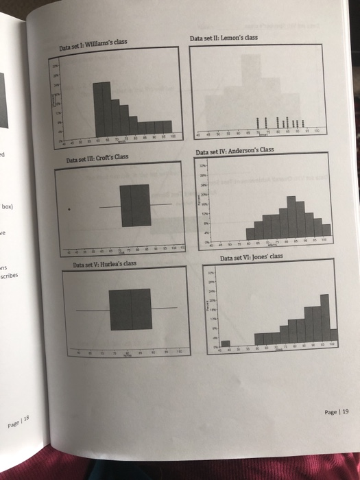


Data set I: Williams's class Data set II: Lemon's class e Data set IIl: Croft's Class Data set IV: Anderson's Class box) ve ns Data set V: Hurlea's class Data set VI: Jones' class scribes 12%- an Page / 18 Page | 19
Data set VII: Spencer's class Data set VIll: Overall Achievement Test Scores Achievement Test Scores Tast Bars 82 70 72 74 Pace/2
Mr. Cole gave a ten-point quiz to his math classes. A total of 50 students took the quiz. Mr. Cole scores Creating histograms quizzes and listed the scores alphabetically as follows. 2nd period Math 4h period Math 1 period Math 9,8, 10, 5,9, 7, 8,9, 8, 5. 8, 10, 8, 8, 5 4, 5, 8,6, 8, 9, 5, 8, 5, 1, 5, 5, 7, 5, 7 6, 4, 5, 7, 5, 9, 5, 4, 6, 6, & 5, 7, 5, 8, 1, 8, 7, 10, 9 S. Use ALL the quiz data to make a frequency table with intervals. Use an interval of 2. Frequency Score 0-1 2-3 4-5 6-7 8-9 10-11 6. Use your frequency table to make a histogram for the data. 20i 16 14- 12 10 8- 6 10 14 Page | 22
7. Describe the data distribution of the histogram you created. Include words such as mode, skewed, outlier, normal, symmetric, center, ond spreod, if they apply-Hint: Don't forget standard deviation) scored the Create a graph of your choice (histogram, boxplot, dotplot) for 1" and 3 period. 9. Which class performed better? 10. Justify your answer by comparing the shape, center, and spread of the two classes. (Hint: Don't forget standard deviation.) Page | 23
Homework Answers
 first complete question
according to HomeworkLib policy.
first complete question
according to HomeworkLib policy.
Add Answer to:
Unit 6 Lesson 3 Classwork (Adapted from Math Vision Project) Data Distribution A lot of information...
Unit 6 Lesson 3 Classwork (Adapted from Math Vision Project) Data Distribution A lot of information...
 Unit 6 Lesson 3 Classwork (Adapted from Math Vision Project) Data Distribution A lot of information can be obtained from looking at data plots and their distributions. It is important when describing data that we use context to communicate the shape, center, and spread. Shape and spread: Modes: uniform (evenly spread- no obvious mode), unimodal (one main peak), bimodal (two main peaks), or multimodal (multiple locations where the data is relatively higher than others). Skewed distribution: when most data is...
1.Construct a frequency distribution for the hybrid cars with a class width of 2. 2.Explain why...
 1.Construct a frequency distribution for the hybrid cars with a
class width of 2.
2.Explain why a class width of 2 is too narrow for these
data.
3.Construct a relative frequency distribution for the hybrid
cars with a class width of 3, where the first class has a lower
limit of 20.
4.Construct a histogram based on this relative frequency
distribution. Is the histogram unimodal or bimodal? Describe the
skewness, if any, in these data.
5.Construct a frequency distribution for...
1.Construct a frequency distribution for the hybrid cars with a
class width of 2.
2.Explain why a class width of 2 is too narrow for these
data.
3.Construct a relative frequency distribution for the hybrid
cars with a class width of 3, where the first class has a lower
limit of 20.
4.Construct a histogram based on this relative frequency
distribution. Is the histogram unimodal or bimodal? Describe the
skewness, if any, in these data.
5.Construct a frequency distribution for...
PLEASE ANSWER CLEARLY The graph below shows the distribution of age by class type (on campus...
 PLEASE ANSWER CLEARLY
The graph below shows the distribution of age by class type (on campus or distance learning) for Math 2600 students during the Fall 2019 semester. The graph on the left corresponds to the ages for Math 2600 online students and the graph on the right corresponds to the Math 2600 students taking class on campus. Summary statistics for Age: Group by: OCDL OCDL Mean Std. dev.. Median Min • Max. Range - Q123 • IQR On Campus...
PLEASE ANSWER CLEARLY
The graph below shows the distribution of age by class type (on campus or distance learning) for Math 2600 students during the Fall 2019 semester. The graph on the left corresponds to the ages for Math 2600 online students and the graph on the right corresponds to the Math 2600 students taking class on campus. Summary statistics for Age: Group by: OCDL OCDL Mean Std. dev.. Median Min • Max. Range - Q123 • IQR On Campus...
Use the following information to answer the next two questions Four histograms are displayed below. 2 0 1 2 345 67 89 10 0 2 45 6 789 10 123 4 5 6789 10 0 1 2 34 5 6 7 8 9 10 0 Match the description...
 Use the following information to answer the next two questions Four histograms are displayed below. 2 0 1 2 345 67 89 10 0 2 45 6 789 10 123 4 5 6789 10 0 1 2 34 5 6 7 8 9 10 0 Match the description to the appropriate histogram. A distribution for the second to last digit of phone numbers sampled from students in a class (i.e., for the phone number 968-9667, the second to last digit...
5. The states' average SAT Math scores, ordered from smallest to largest, appear below. 457 469...
 5. The states' average SAT Math scores, ordered from smallest to largest, appear below. 457 469 487 489 490 490 493 496 499 500 501 501 501 502 502 508 509 511 513 515 516 518 521 523 525 527 529 537 539 541 541 543 545 550 559 565 568 569 570 572 573 591 591 591 593 602 604 606 608 612 617 a. Give the five-number summary of the 51-state average SAT Math scores. b. Make side...
The shape of a distribution is a rough guide to whether the mean and standard deviation...
 The shape of a distribution is a rough guide to whether the mean and standard deviation are a helpful summary of center and variability. Review each of the distributions and determine whether the measures and s would be useful. (a) The figure shows percents of high school graduates in the United States taking the SAT Two peaks suggest that the data include two types of states. 2 20 40 60 80 100 Percent of high school graduates who took the...
Page < 6 > of 12 Lesson 6.2.4: Binomial Distribution and Sample Proportions NEXT STEPS We...
 Page < 6 > of 12 Lesson 6.2.4: Binomial Distribution and Sample Proportions NEXT STEPS We have formulas for the mean (center) and standard deviation (spread) of a distribution of sample proportions. Don't forget the shape! Your graph was bell shaped-symmetric, high in the middle and low at the ends. It is similar to a normal distribution, not smooth, but still bell shaped. Your instructor will now use a computer applet to demonstrate the way that binomial distributions and distributions...
a. Would you assume by only looking at the shape of the distribution that the data...
 a. Would you assume by only looking at the shape of the
distribution that the data is normal, skewed right, or skewed
left?
b. Based on your answer to part (a) above, would you assume that
the mean or the median would be the better predictor of center?
Why?
Histogram of Tuition costs (thousands of dol 9 8 7 5 Frequency 3 N 1 0 16 28 32 20 24 Tuition costs (thousands of dol
a. Would you assume by only looking at the shape of the
distribution that the data is normal, skewed right, or skewed
left?
b. Based on your answer to part (a) above, would you assume that
the mean or the median would be the better predictor of center?
Why?
Histogram of Tuition costs (thousands of dol 9 8 7 5 Frequency 3 N 1 0 16 28 32 20 24 Tuition costs (thousands of dol
A z score of 1.25 represents an observation that is a) 1.25 standard deviation below the...
A z score of 1.25 represents an observation that is a) 1.25 standard deviation below the mean. b) 0.25 standard deviations above the mean of 1. c) 1.25 standard deviations above the mean. d) both b and c Assume that your class took an exam last week and the mean and standard deviation of the exam were 85 and 5, respectively. Your instructor told you that 30 percent of the students had a score of 90 or above. You would...
Assignment-2.pdf (page 1 of 2) Q Search SYC 2317 Mork W. Tengler, MS Assignment #2 An...
 Assignment-2.pdf (page 1 of 2) Q Search SYC 2317 Mork W. Tengler, MS Assignment #2 An instructor obtained the following set of sores from a 10-point quiz for a class of 26 students: 2.1 8, 5, 4, 5, 5, 7, 6, 4, 3, 4, 5, 6, 6, 4, 5, 5, 10, 6, 9, 5, 7, 8, 2, 6, 7, 4 Place the scores in a frequency distribution table. b. Sketch a histogram showing the distribution. Using your graph, answer the...
 Unit 6 Lesson 3 Classwork (Adapted from Math Vision Project) Data Distribution A lot of information can be obtained from looking at data plots and their distributions. It is important when describing data that we use context to communicate the shape, center, and spread. Shape and spread: Modes: uniform (evenly spread- no obvious mode), unimodal (one main peak), bimodal (two main peaks), or multimodal (multiple locations where the data is relatively higher than others). Skewed distribution: when most data is...
 1.Construct a frequency distribution for the hybrid cars with a
class width of 2.
2.Explain why a class width of 2 is too narrow for these
data.
3.Construct a relative frequency distribution for the hybrid
cars with a class width of 3, where the first class has a lower
limit of 20.
4.Construct a histogram based on this relative frequency
distribution. Is the histogram unimodal or bimodal? Describe the
skewness, if any, in these data.
5.Construct a frequency distribution for...
1.Construct a frequency distribution for the hybrid cars with a
class width of 2.
2.Explain why a class width of 2 is too narrow for these
data.
3.Construct a relative frequency distribution for the hybrid
cars with a class width of 3, where the first class has a lower
limit of 20.
4.Construct a histogram based on this relative frequency
distribution. Is the histogram unimodal or bimodal? Describe the
skewness, if any, in these data.
5.Construct a frequency distribution for...
 PLEASE ANSWER CLEARLY
The graph below shows the distribution of age by class type (on campus or distance learning) for Math 2600 students during the Fall 2019 semester. The graph on the left corresponds to the ages for Math 2600 online students and the graph on the right corresponds to the Math 2600 students taking class on campus. Summary statistics for Age: Group by: OCDL OCDL Mean Std. dev.. Median Min • Max. Range - Q123 • IQR On Campus...
PLEASE ANSWER CLEARLY
The graph below shows the distribution of age by class type (on campus or distance learning) for Math 2600 students during the Fall 2019 semester. The graph on the left corresponds to the ages for Math 2600 online students and the graph on the right corresponds to the Math 2600 students taking class on campus. Summary statistics for Age: Group by: OCDL OCDL Mean Std. dev.. Median Min • Max. Range - Q123 • IQR On Campus...
 Use the following information to answer the next two questions Four histograms are displayed below. 2 0 1 2 345 67 89 10 0 2 45 6 789 10 123 4 5 6789 10 0 1 2 34 5 6 7 8 9 10 0 Match the description to the appropriate histogram. A distribution for the second to last digit of phone numbers sampled from students in a class (i.e., for the phone number 968-9667, the second to last digit...
 5. The states' average SAT Math scores, ordered from smallest to largest, appear below. 457 469 487 489 490 490 493 496 499 500 501 501 501 502 502 508 509 511 513 515 516 518 521 523 525 527 529 537 539 541 541 543 545 550 559 565 568 569 570 572 573 591 591 591 593 602 604 606 608 612 617 a. Give the five-number summary of the 51-state average SAT Math scores. b. Make side...
 The shape of a distribution is a rough guide to whether the mean and standard deviation are a helpful summary of center and variability. Review each of the distributions and determine whether the measures and s would be useful. (a) The figure shows percents of high school graduates in the United States taking the SAT Two peaks suggest that the data include two types of states. 2 20 40 60 80 100 Percent of high school graduates who took the...
 Page < 6 > of 12 Lesson 6.2.4: Binomial Distribution and Sample Proportions NEXT STEPS We have formulas for the mean (center) and standard deviation (spread) of a distribution of sample proportions. Don't forget the shape! Your graph was bell shaped-symmetric, high in the middle and low at the ends. It is similar to a normal distribution, not smooth, but still bell shaped. Your instructor will now use a computer applet to demonstrate the way that binomial distributions and distributions...
 a. Would you assume by only looking at the shape of the
distribution that the data is normal, skewed right, or skewed
left?
b. Based on your answer to part (a) above, would you assume that
the mean or the median would be the better predictor of center?
Why?
Histogram of Tuition costs (thousands of dol 9 8 7 5 Frequency 3 N 1 0 16 28 32 20 24 Tuition costs (thousands of dol
a. Would you assume by only looking at the shape of the
distribution that the data is normal, skewed right, or skewed
left?
b. Based on your answer to part (a) above, would you assume that
the mean or the median would be the better predictor of center?
Why?
Histogram of Tuition costs (thousands of dol 9 8 7 5 Frequency 3 N 1 0 16 28 32 20 24 Tuition costs (thousands of dol
 Assignment-2.pdf (page 1 of 2) Q Search SYC 2317 Mork W. Tengler, MS Assignment #2 An instructor obtained the following set of sores from a 10-point quiz for a class of 26 students: 2.1 8, 5, 4, 5, 5, 7, 6, 4, 3, 4, 5, 6, 6, 4, 5, 5, 10, 6, 9, 5, 7, 8, 2, 6, 7, 4 Place the scores in a frequency distribution table. b. Sketch a histogram showing the distribution. Using your graph, answer the...
Most questions answered within 3 hours.
-
Consider the reaction, C3 H8 + O2 --> CO2 + H2O. How many
moles of O2...
asked 21 minutes ago -
You and your opponent both roll a fair die. If you both roll the
same number,...
asked 38 minutes ago -
In a study of the accuracy of fast food drive-through orders,
Restaurant A had 257 accurate...
asked 38 minutes ago -
Identify and describe in detail the four categories of
institutions that could be included in a...
asked 43 minutes ago -
In python
class Customer:
def __init__(self, customer_id, last_name, first_name, phone_number, address):
self._customer_id = int(customer_id)
self._last_name =...
asked 51 minutes ago -
What is an example of a limitation in implementing a new
ERP system and how it...
asked 46 minutes ago -
In a section of 9.7cm of an artery with a radius of 2.6mm there
is a...
asked 47 minutes ago -
the two carboxylic acid groups of aspartic acid have different
acidities with pKa values of 2.1...
asked 51 minutes ago -
Would CuCO3 aqueous salt combined with calcium chloride
form a solid precipitate? If so, what would...
asked 50 minutes ago -
How do ECM Solutions assist in embedding a culture of continuous
improvement in an organization? (Project...
asked 1 hour ago -
Directions
These directions introduce the idea of Essential Questions.
Since this may be a new concept...
asked 1 hour ago -
1.b. Fiscal policy is said to suffer from ‘crowding out’.
Explain what this means and why...
asked 1 hour ago